 Featured As : Top Most Creative Agency in India.....
 +91 99205 57647
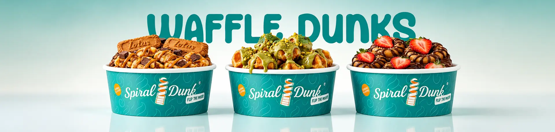
When Spiral Dunk approached us, they weren’t looking for a conventional branding agency for desserts. All they came with was a clear insight: this dessert doesn’t exist in India yet. Yes, its type had already made waves internationally, but bringing it home meant building the brand from the ground up. No existing visual benchmarks, machinery references, or familiar product formats. What the founder did know was this: if the brand was going to capture attention and drive a trail, the brand had to look as tempting as the dessert itself. That’s when we decided to dunk-in!
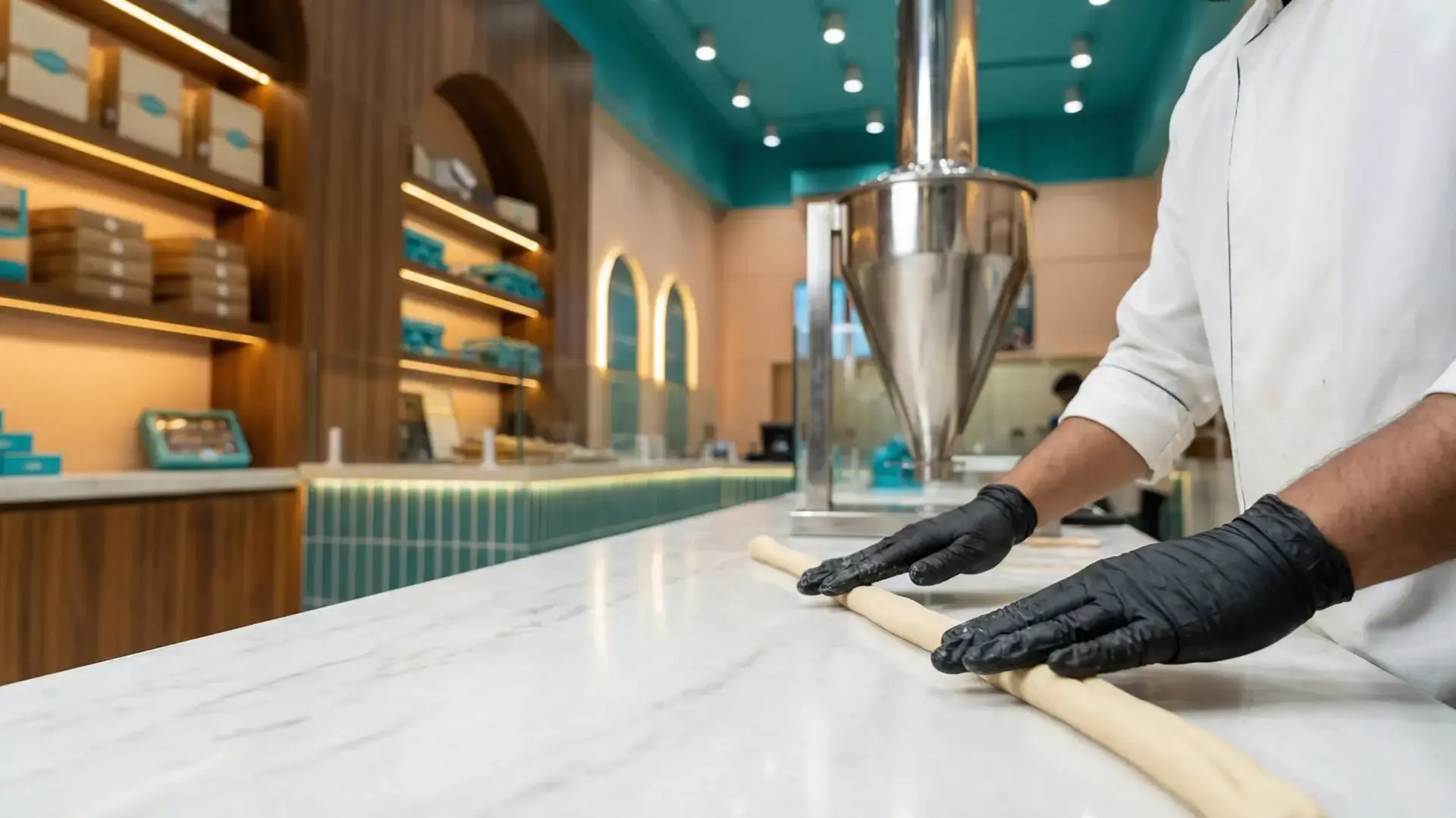
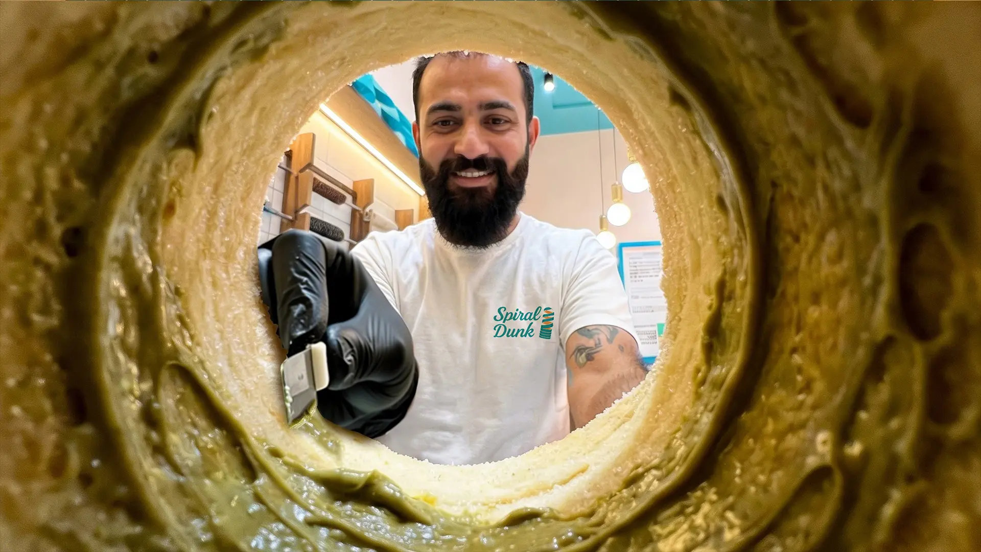
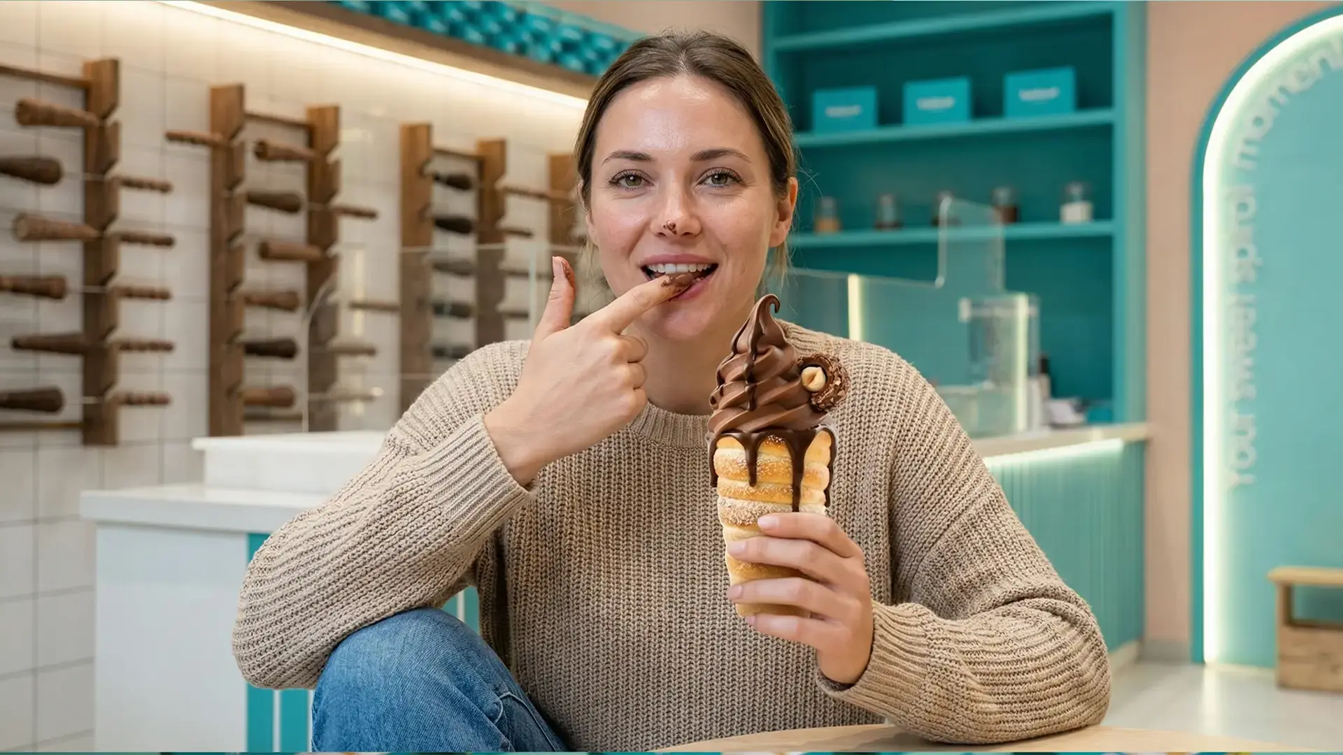
From day one, the strategic challenge was clear: how do you introduce and position an entirely new dessert category? Doughnuts, waffles, pancakes: these formats were already familiar to the Indian consumer. Spiral cones and cylinders? Not yet. We worked closely with the client to translate an early-stage spiral concept into a bold, crave-worthy brand identity, to confidently own its “first-of-its-kind” positioning. From product visualisation and packaging to colour palettes and spatial design, every element was crafted to trigger curiosity, emotional connection, and the irresistible urge to try it just once.
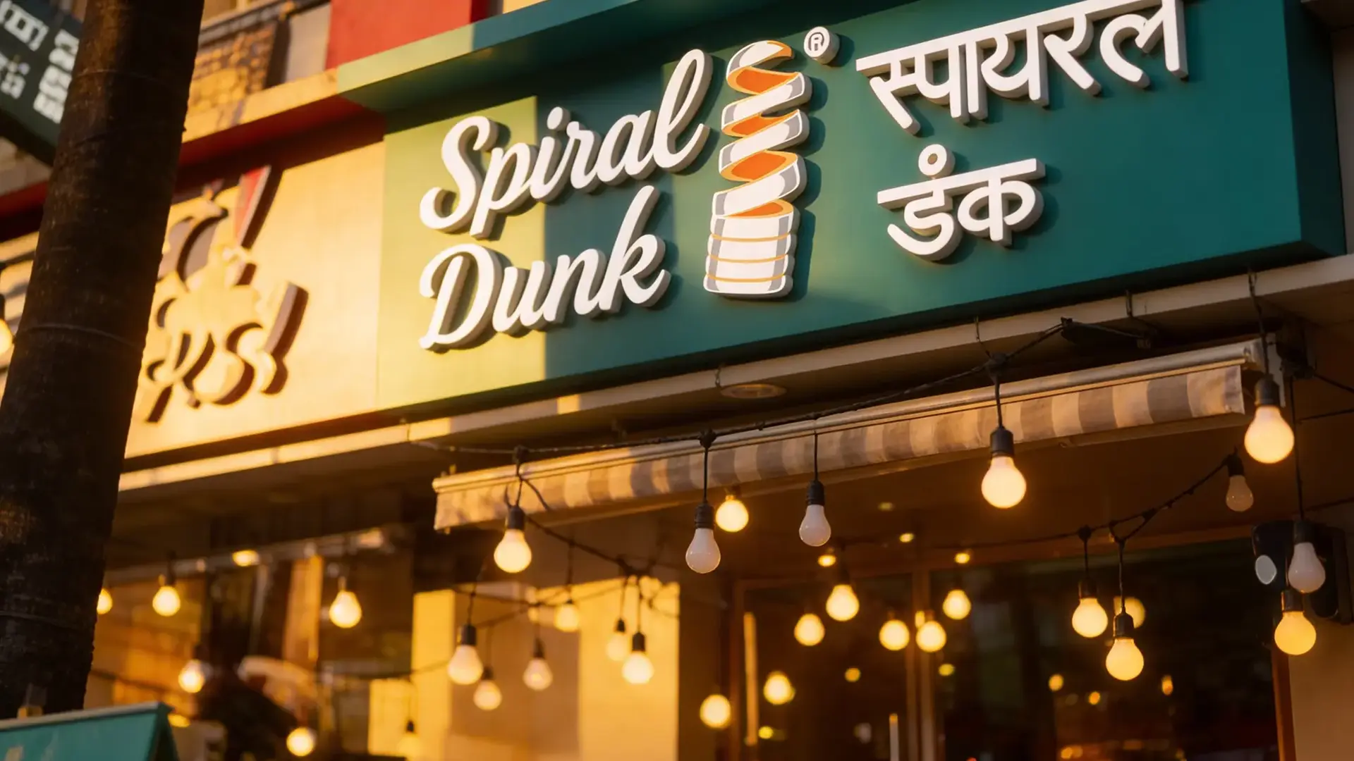
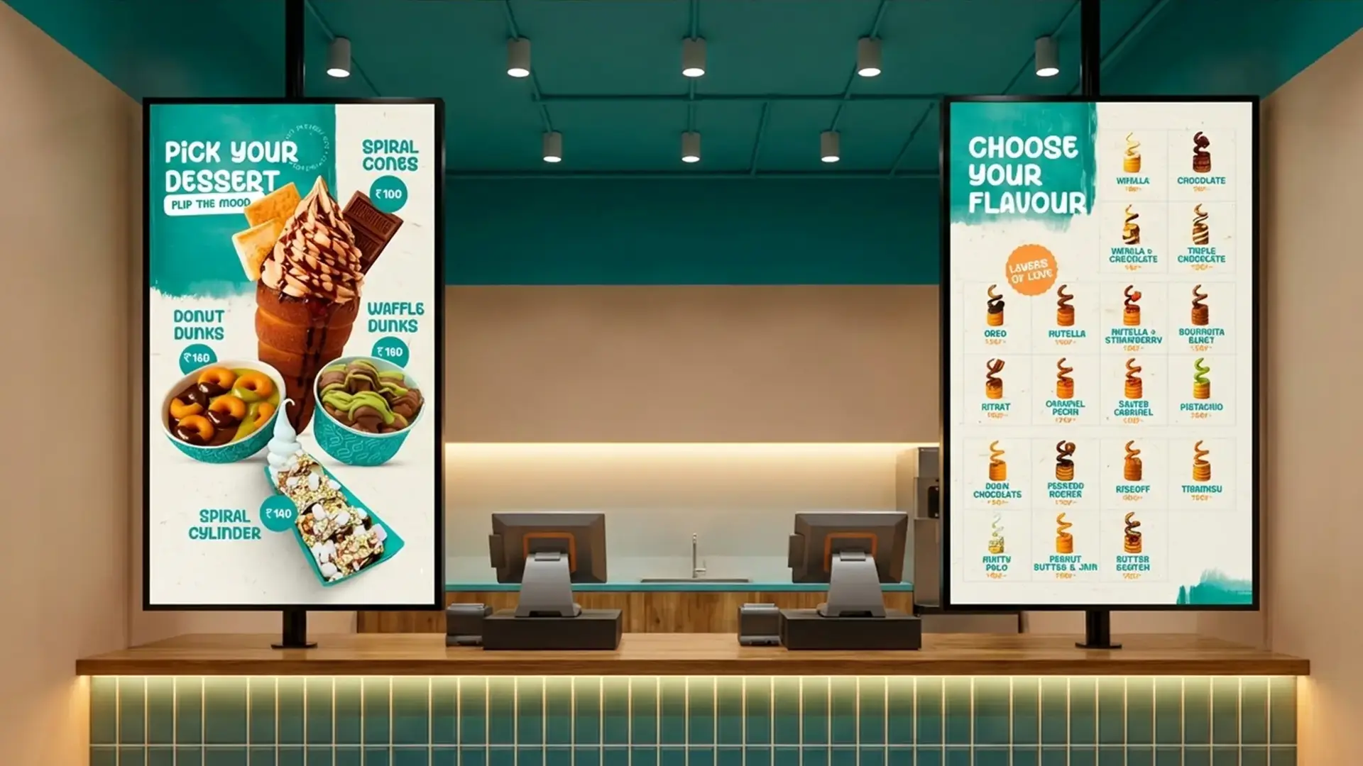
Twist Before the Taste: Finding the Brand’s Core
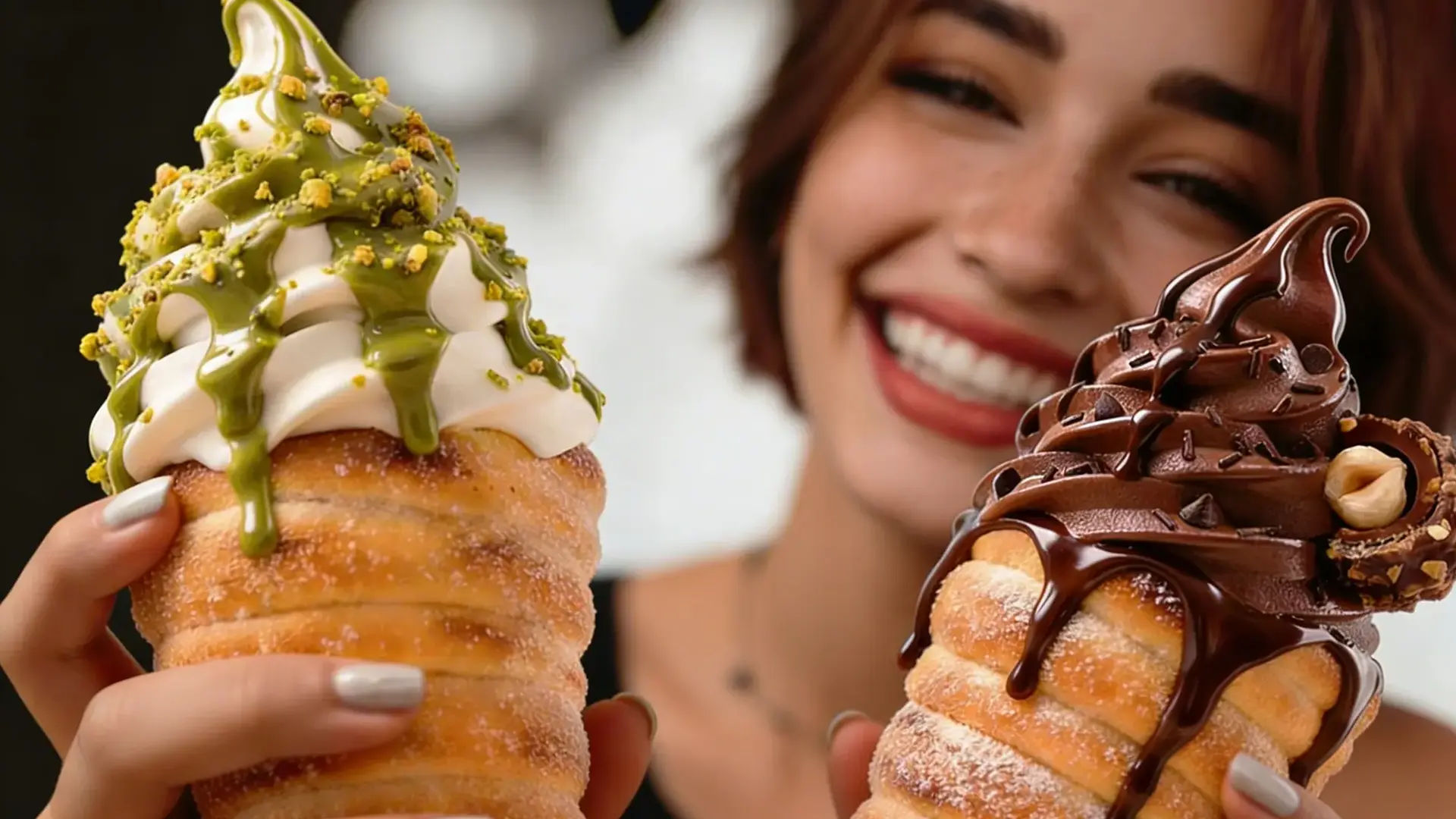
Every dessert has a hero brand element. For Spiral Dunk, it was obvious: the spiral. That was established, but how do you transform a visual form into a scalable brand asset? We went back to the basics, challenging category conventions about cones, donuts, and waffles. What emerged was a clear positioning: Spiral Dunk wasn’t another dessert outlet; it was a completely new dessert format within the category. And that meant the spiral had to lead everything from logo to packaging to visual language.
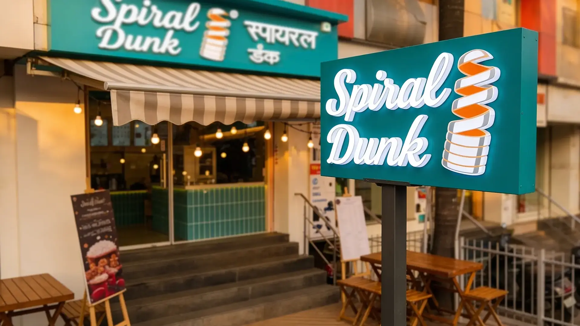
As a branding agency for desserts, we treated the spiral not as a decorative motif, but as the core brand protagonist. From a design perspective, the logo embraced movement, while the layouts echoed rotation. Even the way the products were imagined suggested motion and indulgence, like a dessert that draws the consumer in before they even taste it. The spiral wasn’t just seen, it was felt.
No References? No Problem. We Baked it from Scratch
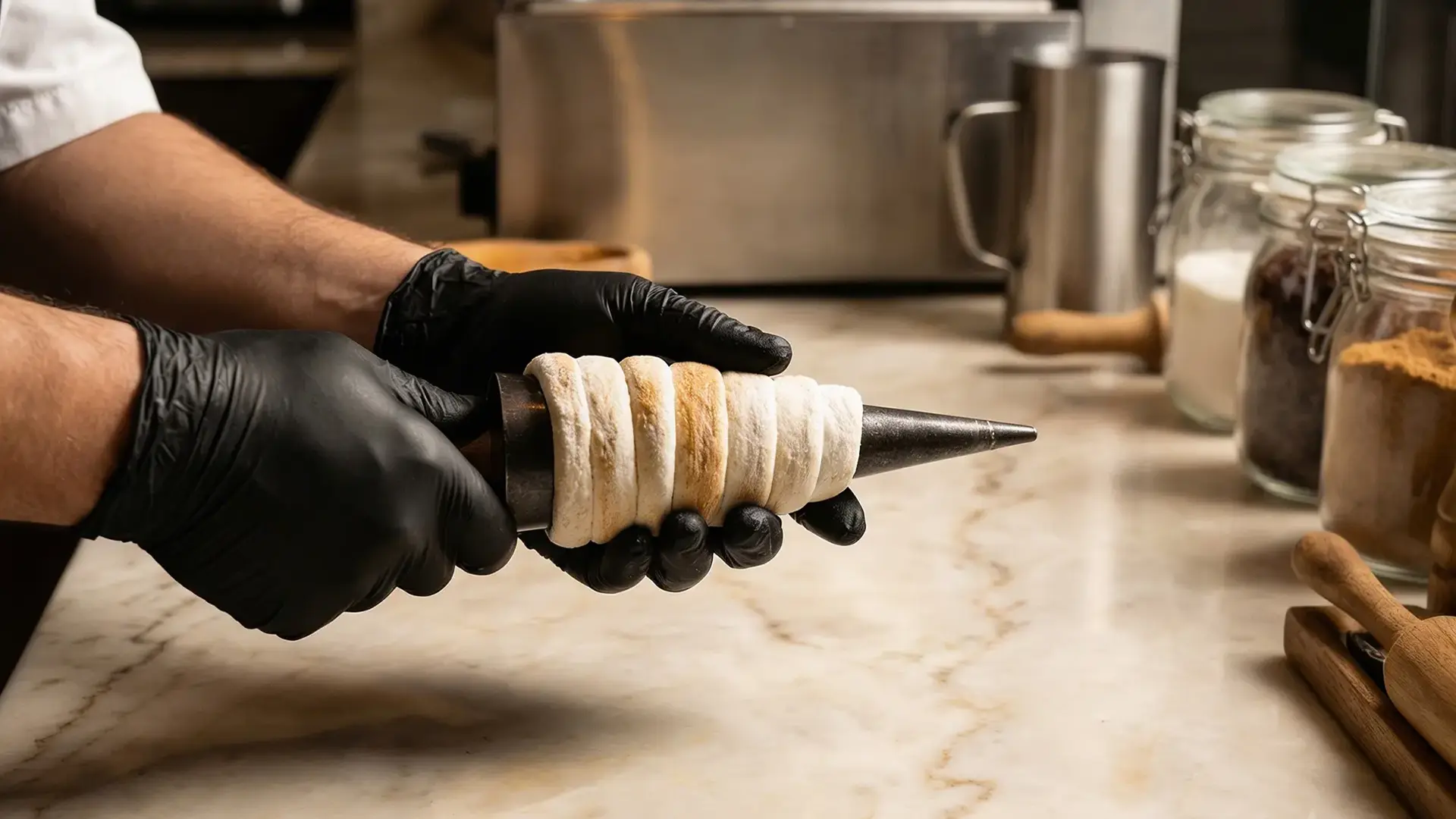
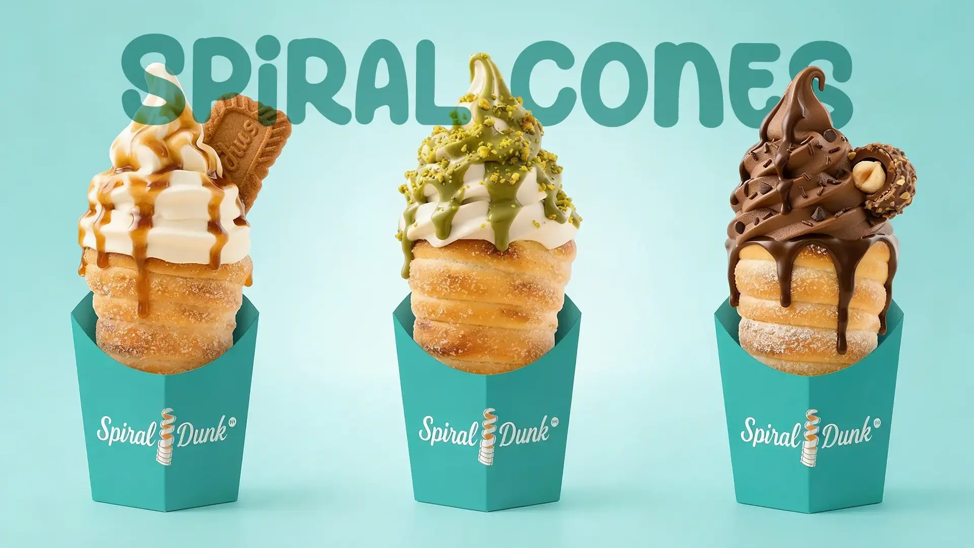
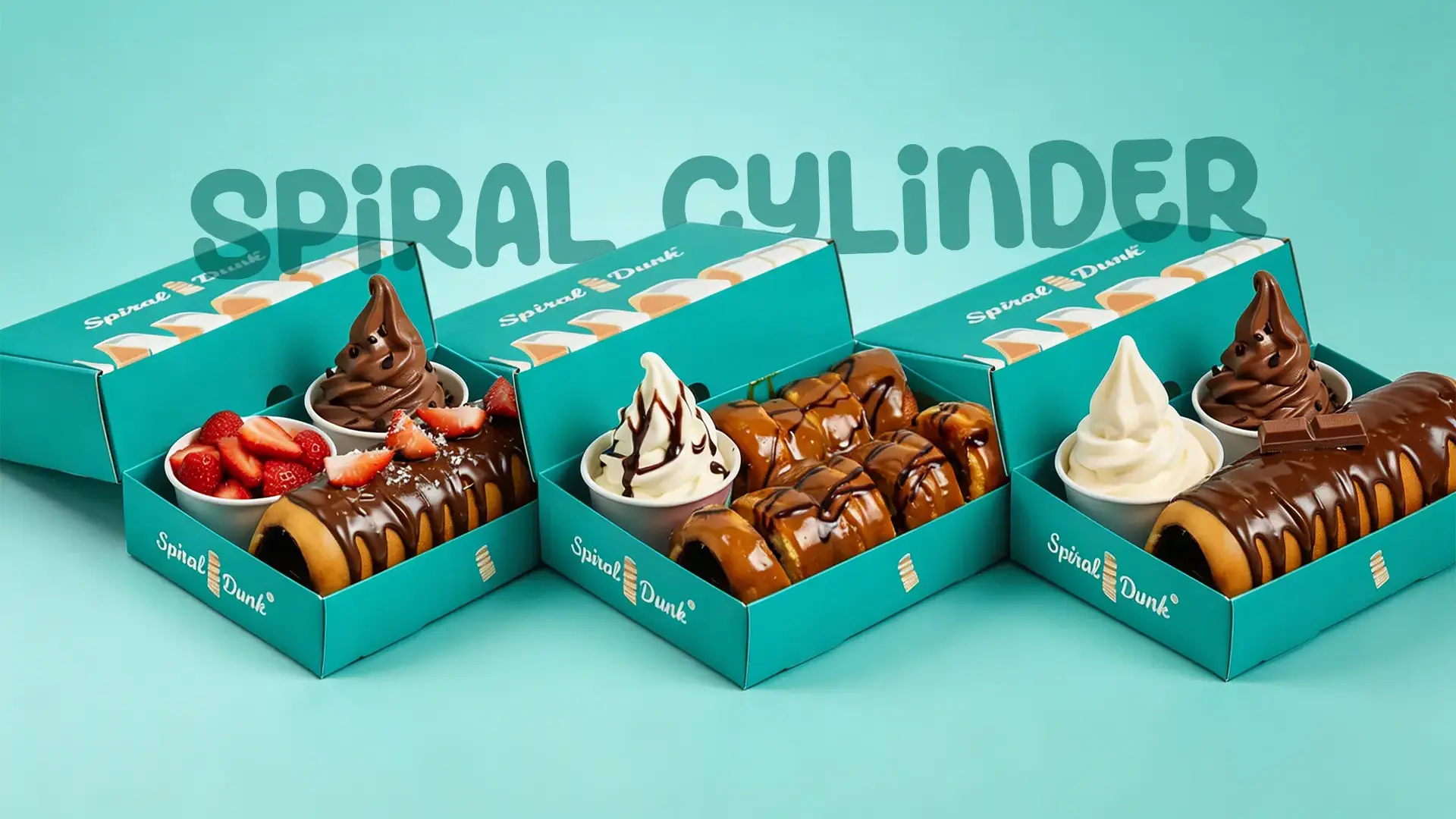
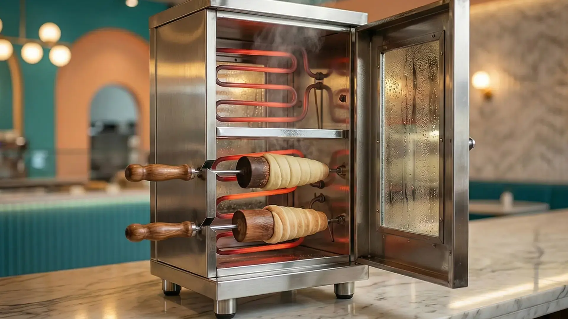
Here’s where things got sticky (in the best way). There were barely any global references, and none in India. Furthermore, though there may be one or two similar brands globally, none of them had established strong or clearly defined branding. In a crowded Indian market, a unique and distinctive brand identity was essential to position the brand effectively and stand out. So, we did what any sugar-fueled creative team would do, we built the brand ecosystem. Using sketches, AI-assisted explorations, and international cues, we visualised spiral cones, spiral cylinders, and dunkable donuts, and waffle formats that didn’t yet physically exist.
This wasn’t about trends; it was about invention. Being a branding agency for Desserts meant thinking beyond surface-level visuals and into product imagination. What would make someone stop at a buzzing Mumbai food street? What would influencers want to film? What would look indulgent even before the first bite? Each answer layered into a brand that looked unmistakably new.
Packaging that Makes you Peek Before You Eat
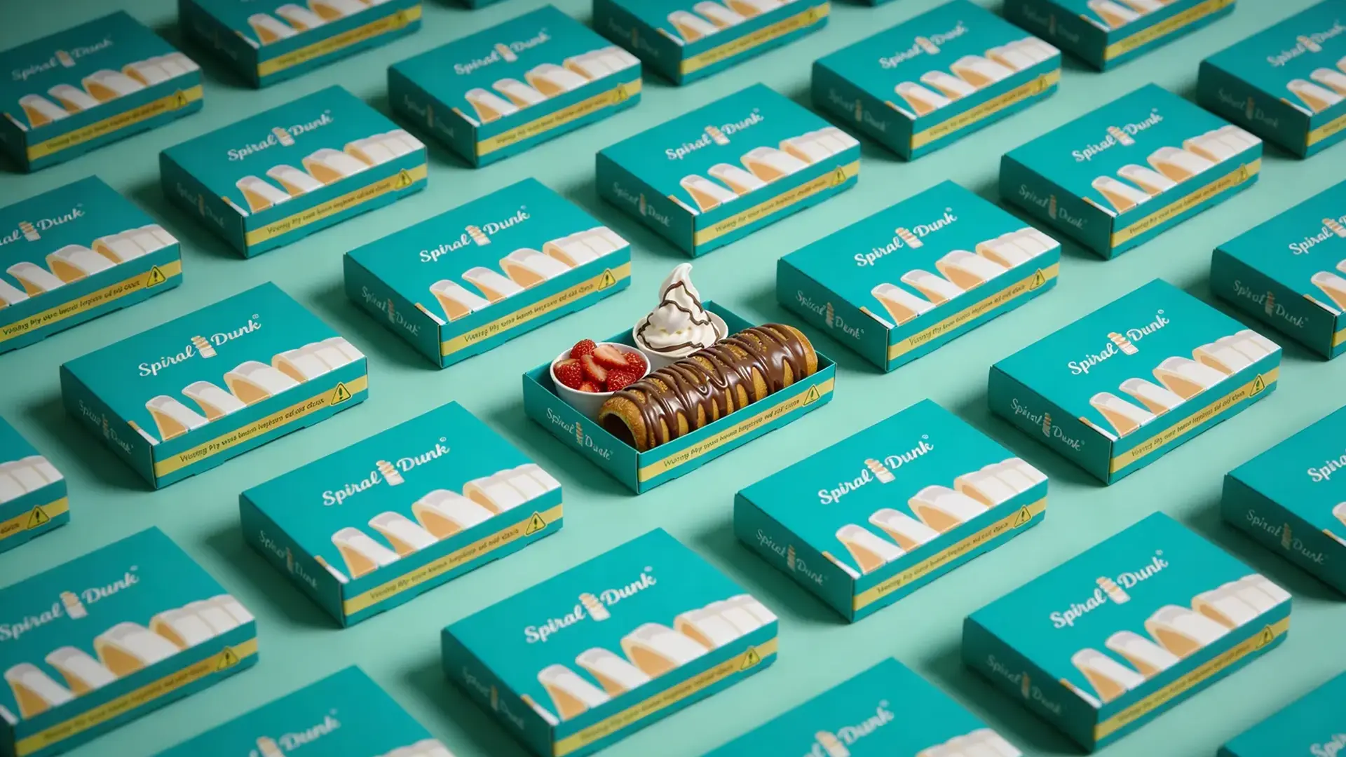
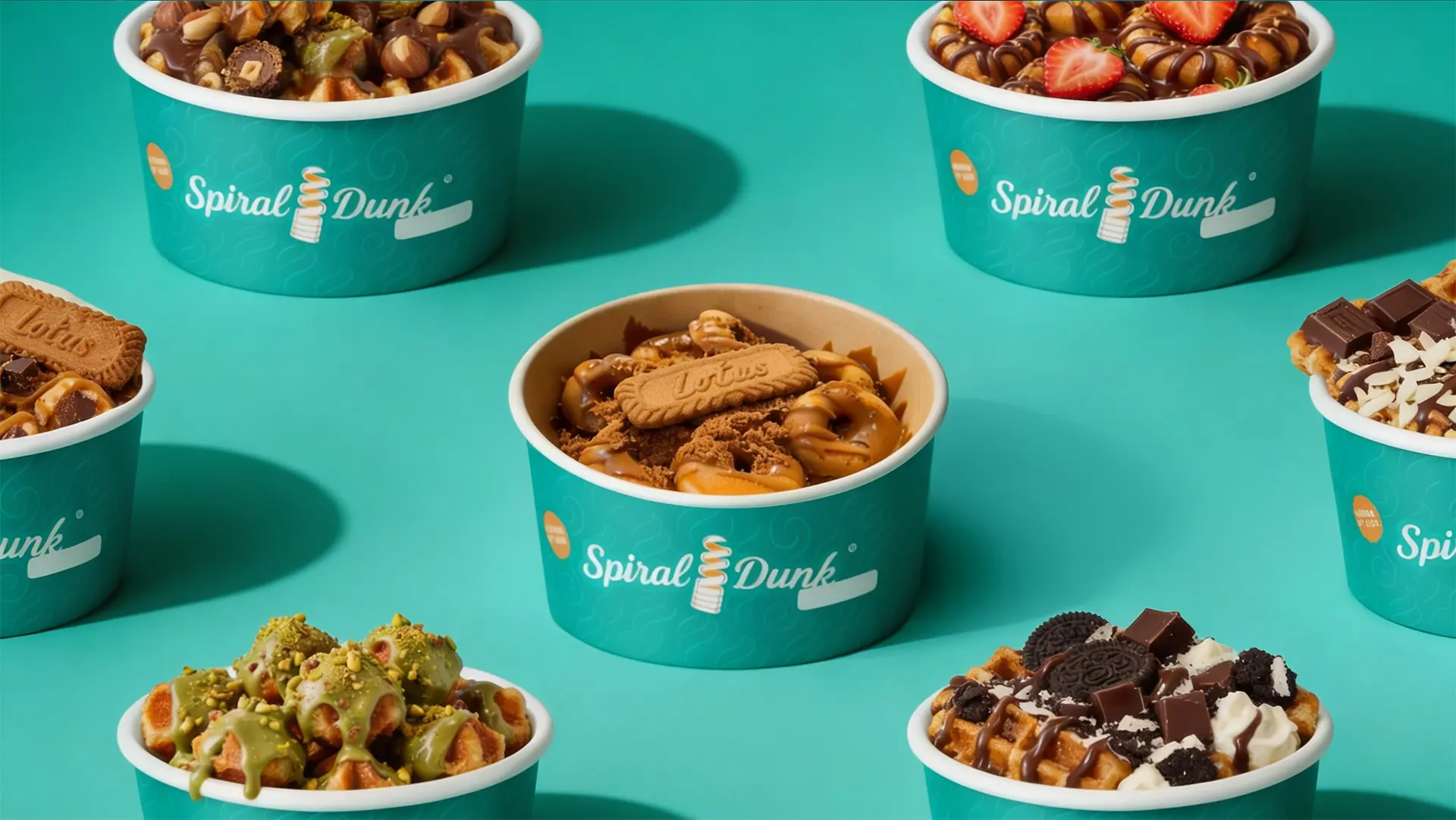
If the product was the hook, packaging was the long-term brand engagement. The challenge? Creating packaging for shapes no local vendor had ever produced. Sleeves, boxes, pouches, everything had to be designed around the spiral, rather than adapting to off-the-shelf packaging formats.
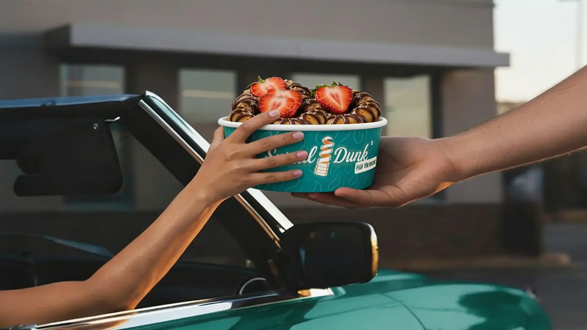
Colours leaned into premium English tones, striking the balance between playful desserts and elevated branding.Working as a dessert branding agency in Mumbai, we also kept context in mind. This brand lived in a viral food hotspot, where presentation matters as much as taste. The packaging had to perform strongly across visual and social platforms, stack well, and survive the chaos of street-side indulgence, all while staying undeniably Spiral Dunk.
Designing Temptation (Yes, That’s a Skill)
Desserts are driven by emotion. They’re impulse-driven, nostalgic, and a little indulgent. Our goal was simple: make people say, “I don’t know what this is, but I want it.” Every visual touchpoint, from colour palettes to typography was crafted to amplify temptation. We tested, tweaked, retrained, and refined until the brand felt irresistible.
This is where Creative branding for Desserts truly came alive. Bold yet controlled. Playful yet premium. Just deliciously confident. The spiral became a symbol of indulgence, curiosity, and novelty; exactly what the brand needed to justify its first-of-a-kind claim.

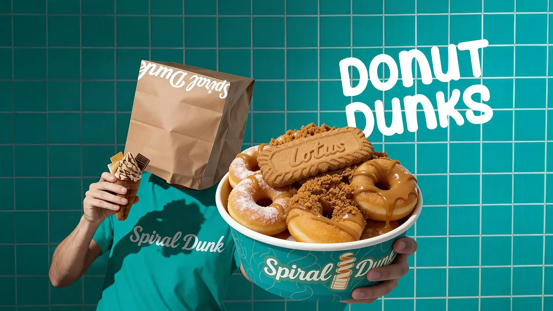
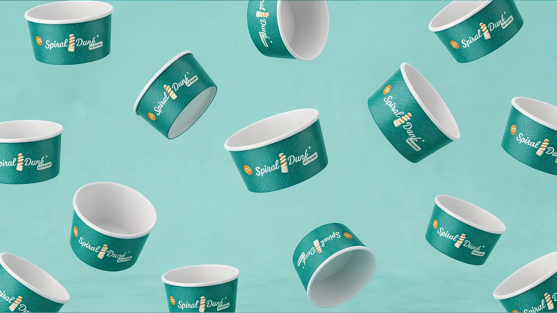
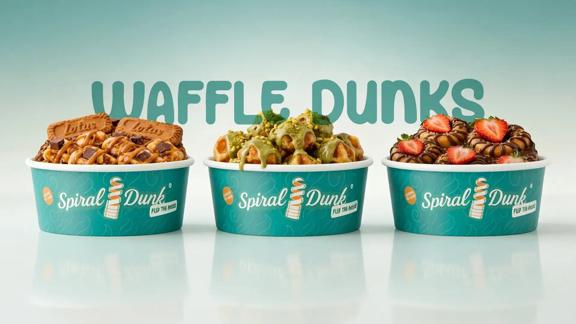
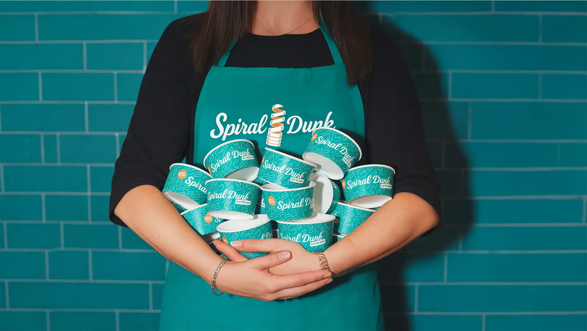
From Street Buzz to Brand Recall
Once the visuals came together, the brand ecosystem came together cohesively. The spiral cone became the hero. The brand language established a consistent brand voice. The environment supported the experience. What started as a vague idea transformed into a dessert brand people could recognise, remember, and crave.
As a branding agency for desserts, our role wasn’t just to design; it was to strategise consumer desire and brand recall. Spiral Dunk now stands as proof that when branding leads, products follow. Sometimes, all it takes to stand out in a crowded dessert market… is a little twist.