Featured As : Top Most Creative Agency in India.....
 +91 99205 57647
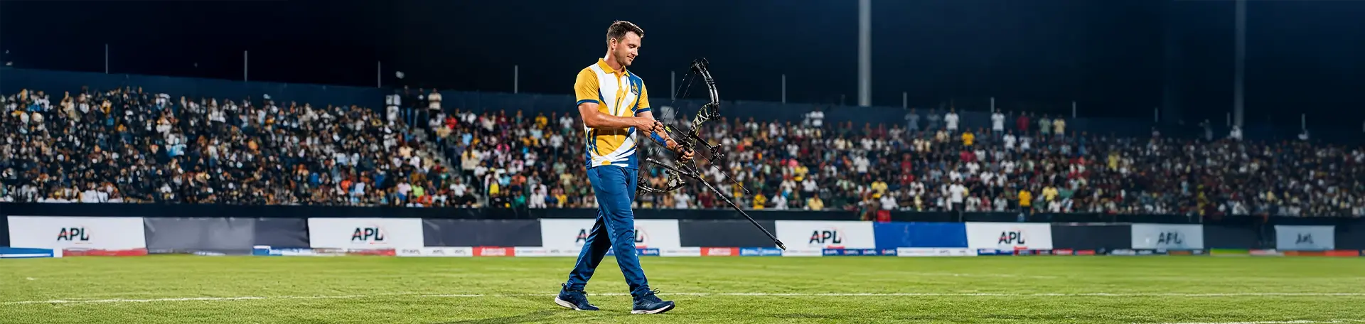
It’s not very often that a sports design agency such as ours would get to architect a first-of-its-kind sports brand. But here was the catch… we had 20 days to deliver what seemed like an extremely ambitious brand mandate.
“We need branding for six team , a league identity, and jersey designs. We loved what you did with Euro T20, especially after we read your case study online and saw the designs ourselves.”
Just a brief, honest conversation before we pulled back the string. Our strategic approach resonated instantly, and the clock demanded a quick release.
So, after the meeting, I went straight to my team, “Leave whatever you are all doing.” They all turned towards me, “Order your favourite food, and grab some caffeinated drinks. We’re going to pull some all-nighters for this one!” After a few sighs and Swiggys, we got started.
What followed was a blur of sketches, calls, late-night revisions, and coffee-fueled brainstorming. But in the end, it became one of our proudest projects yet: the Archery Premier League.
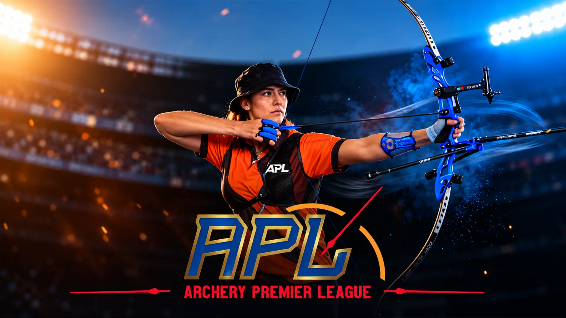
When our sports design agency was approached to create the brand identity for the world’s first Archery Premier League, we knew we weren’t just making logos, we were shaping the face of a new sport.
Hitting the Bullseye: How We Branded the World’s First Archery Premier League
From the very start, our vision at Cheers Creatives was clear, to bring the world’s first Archery Premier League to life through design that felt as powerful, precise, and dynamic as the sport itself. We thrive on challenges that demand speed and storytelling in equal measure, and this project was no exception.
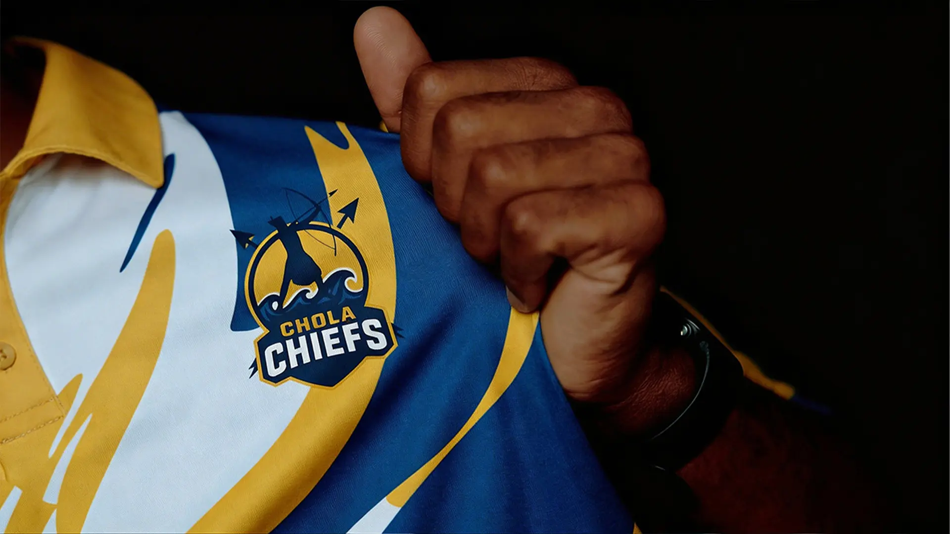
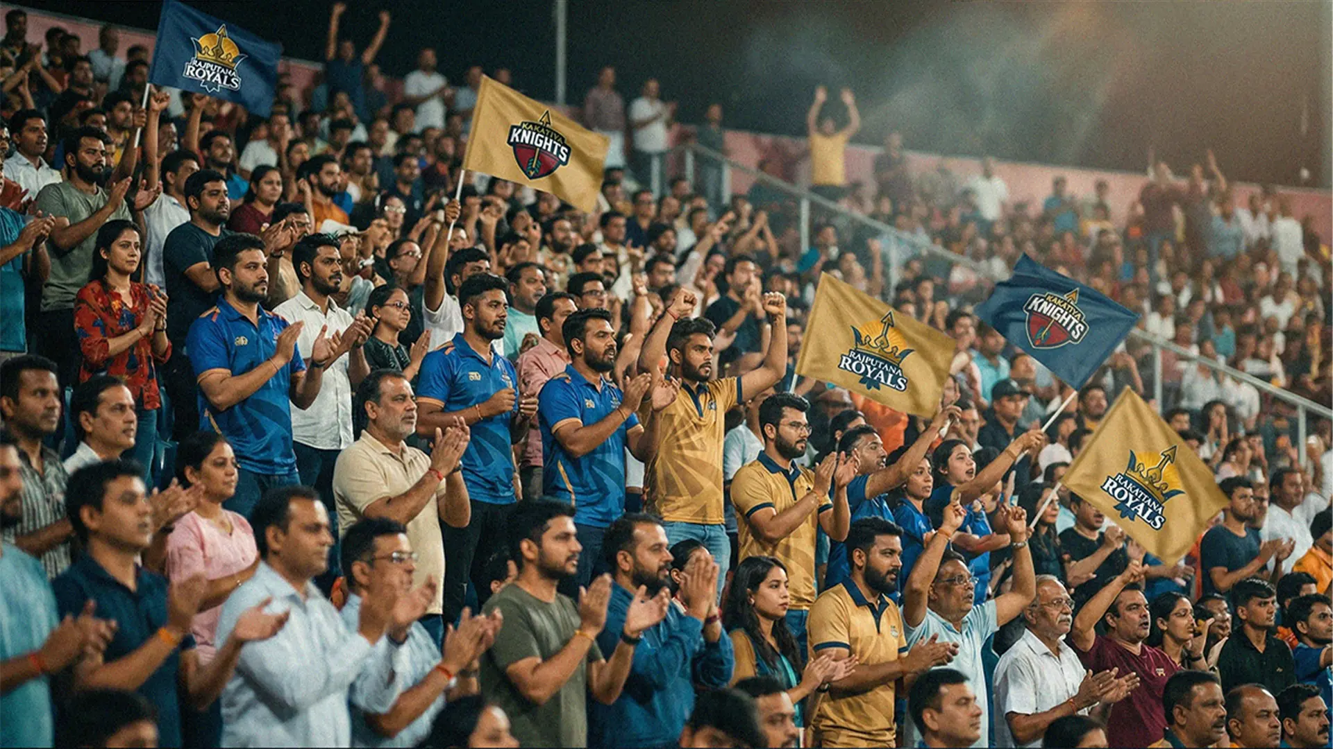
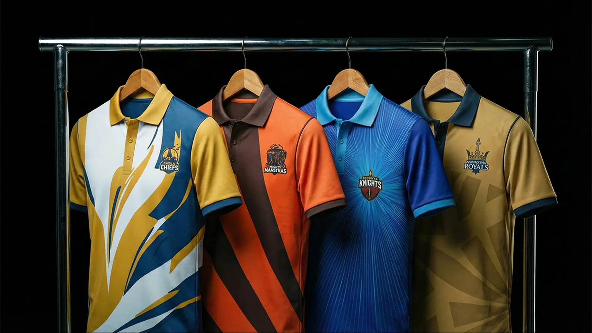
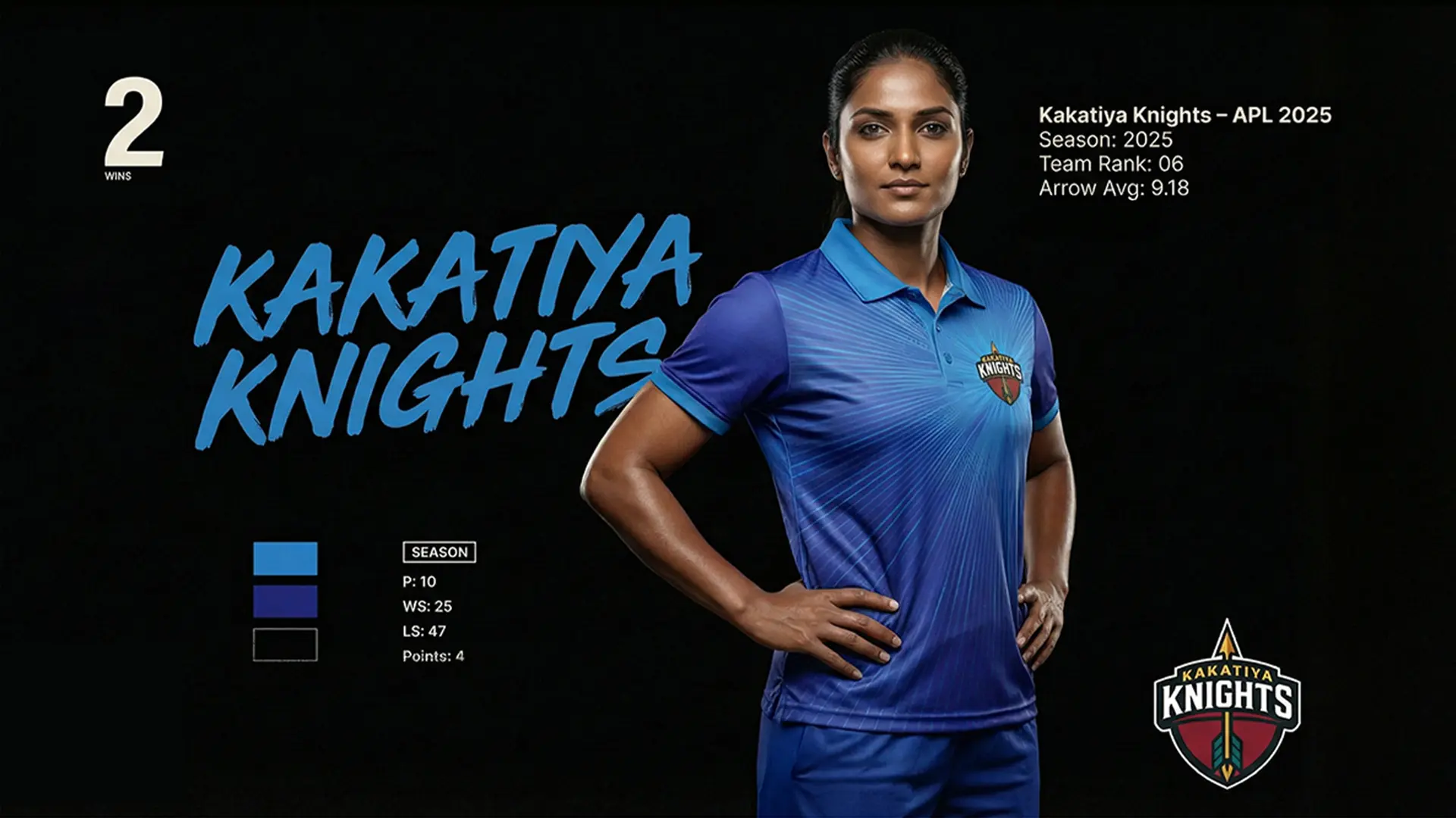
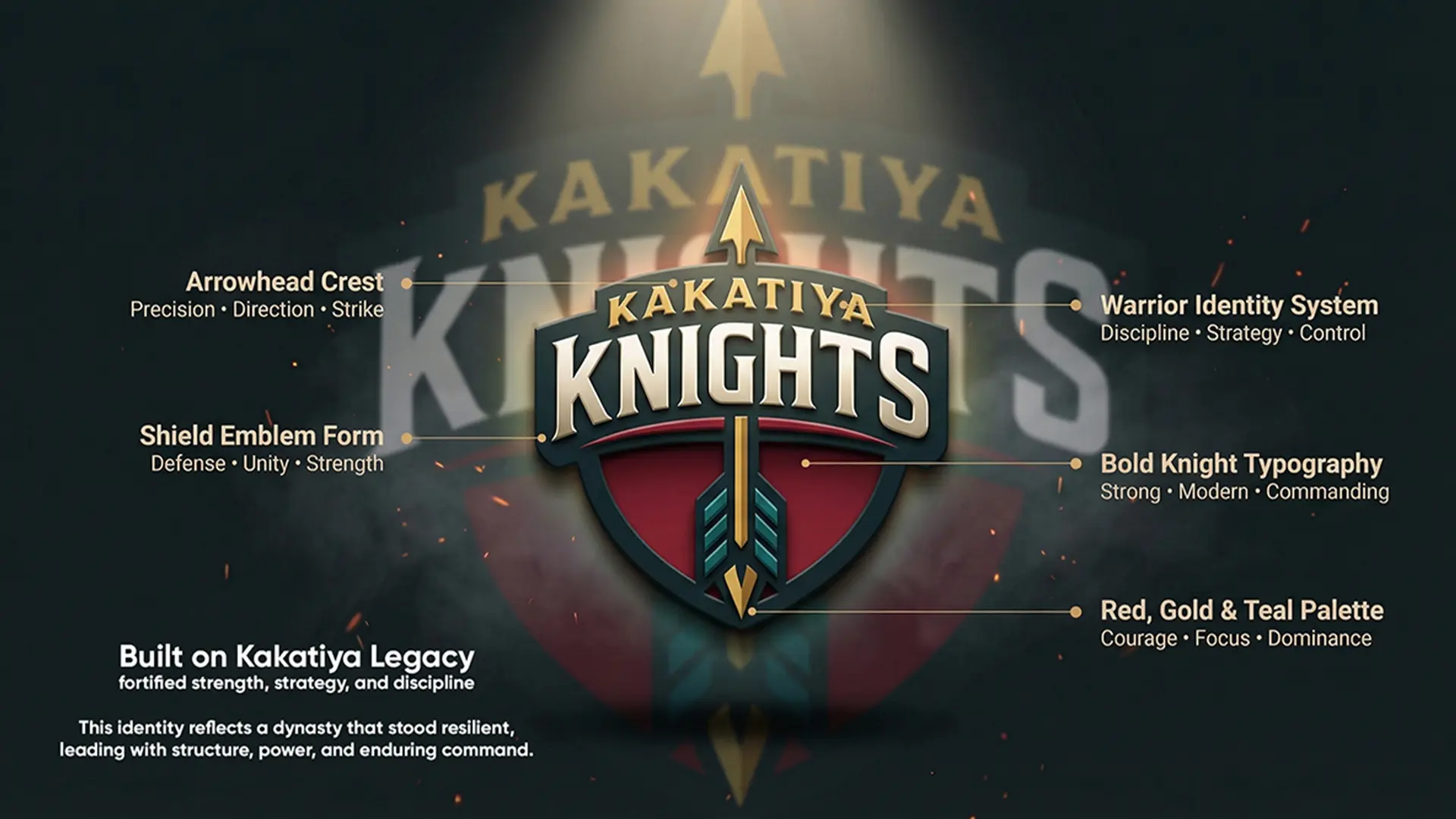
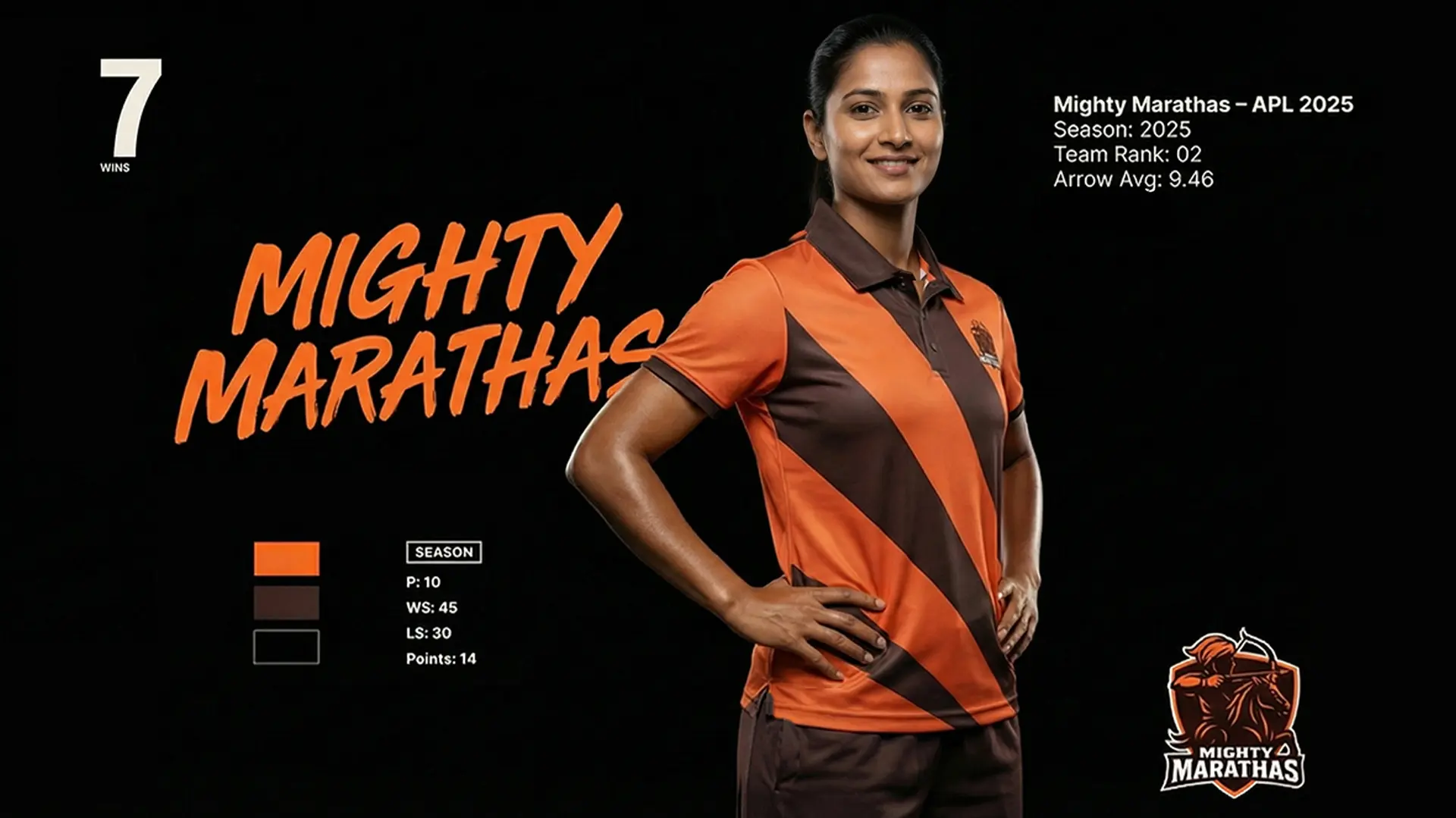
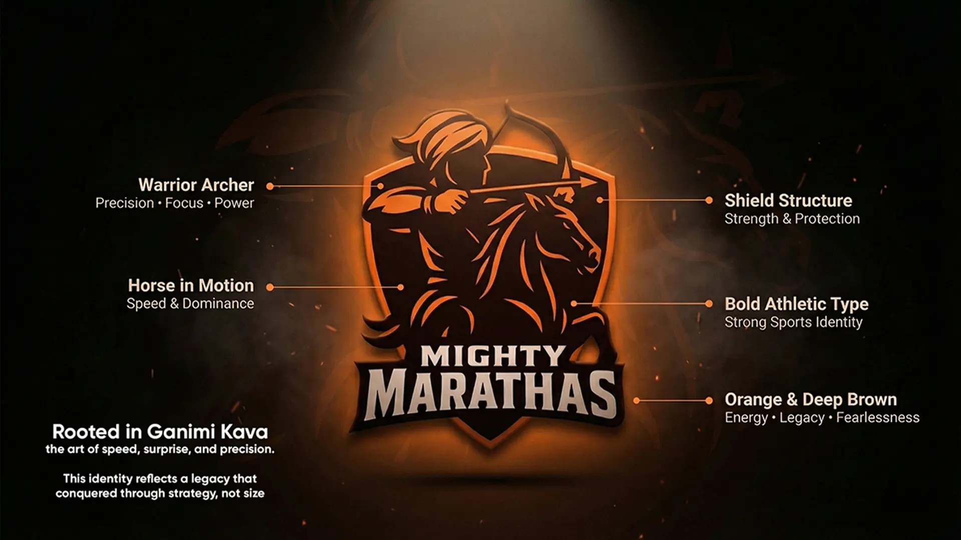
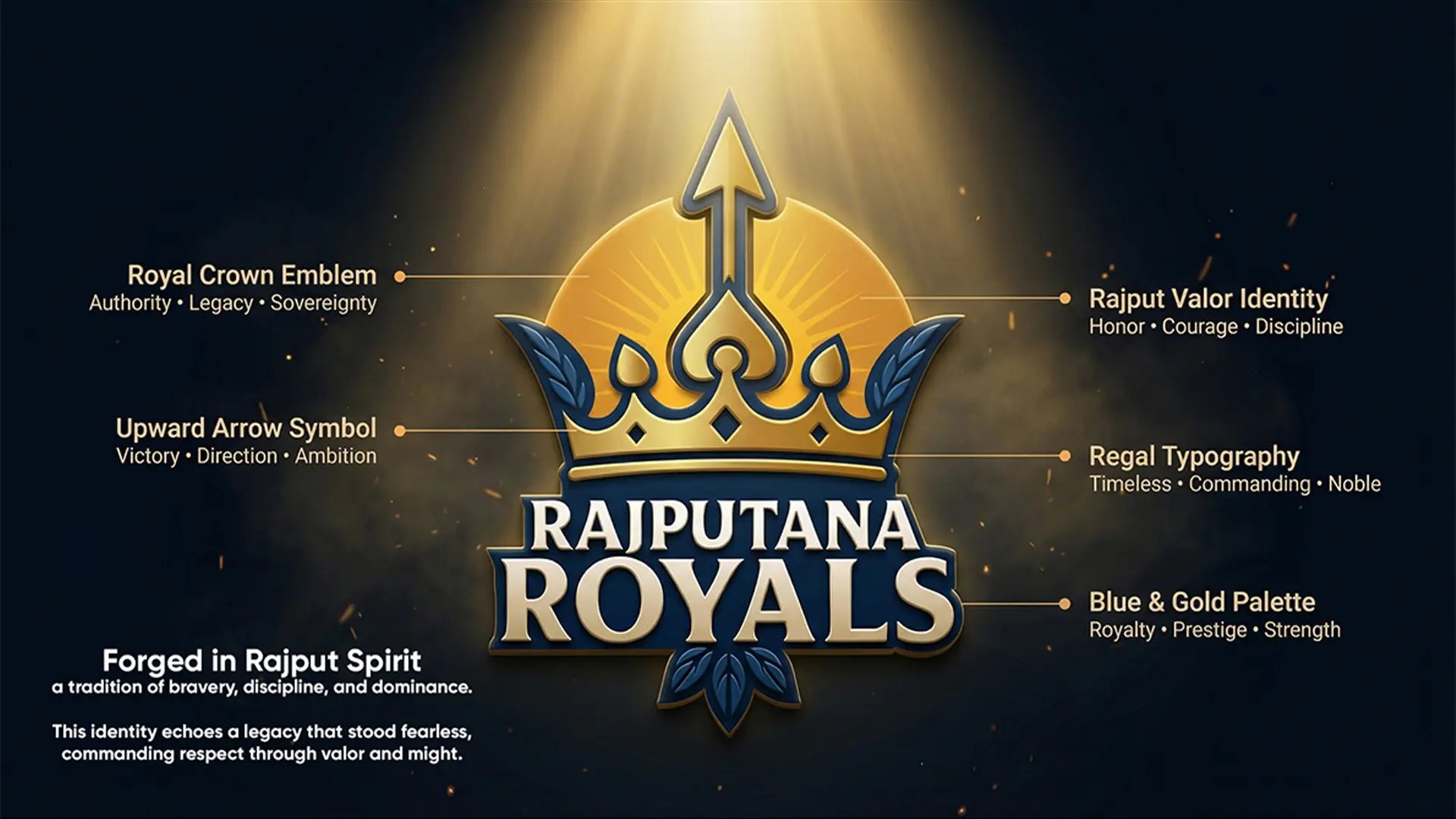
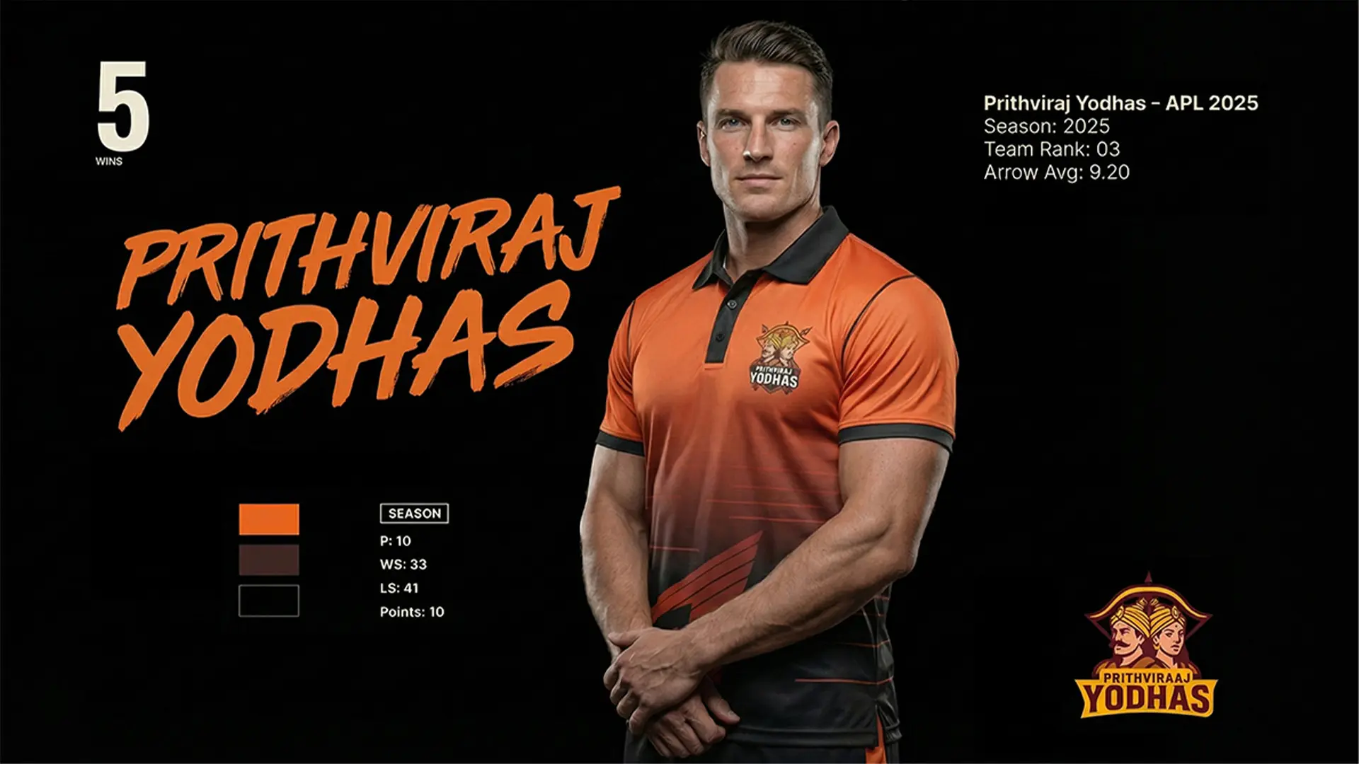
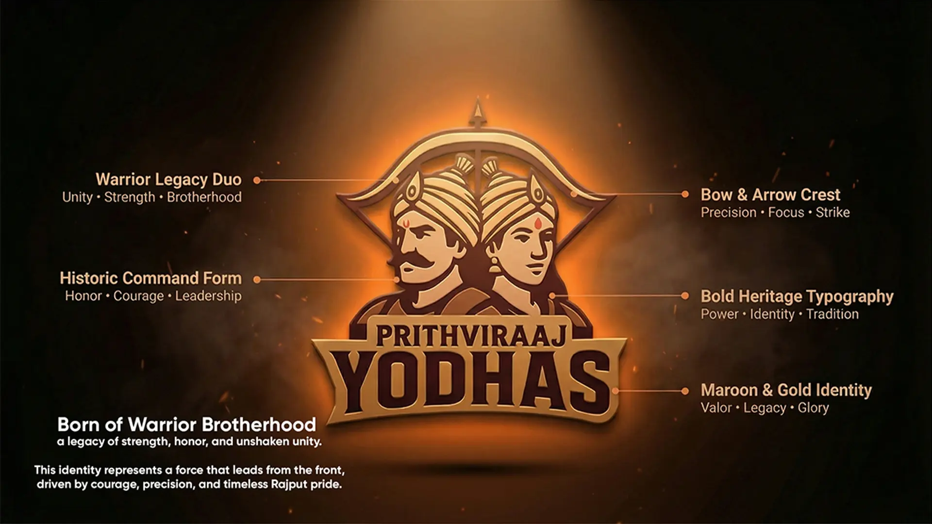
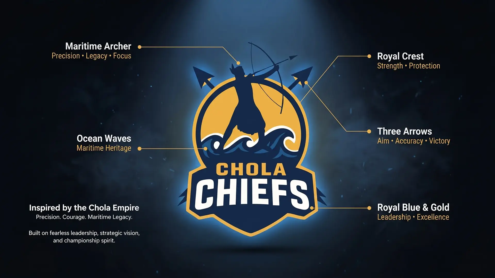
Our scope was massive. We were tasked with identities, extending across key sports marketing collaterals including jerseys, caps, flags, on-ground banners, and fan merchandise. Each logo was inspired by distinct regional histories, warrior legacies, and cultural symbolism. Every emblem had to tell a story, from the Prithviraj Yoddhas representing Delhi’s to the echoing a royal legacy. So, these elements were translated onto high-impact sports collateral such as team flags, fan caps, jersey detailing, and match-day visuals, ensuring the identity felt powerful both on-screen and on-ground.
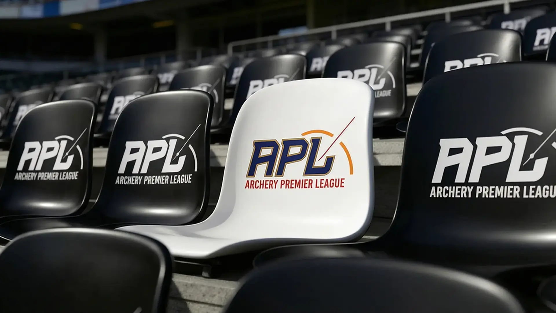
Our sports design agency has a motto that shoots beyond mere aesthetics. We were tasked with building a brand foundation for an entire league, one that could be consistently deployed across jerseys, caps, flags, perimeter boards, stage backdrops, and broadcast graphics. This required a strict strategic blueprint that ensured every asset, from the master APL logo to each team emblem, met uncompromising standards.
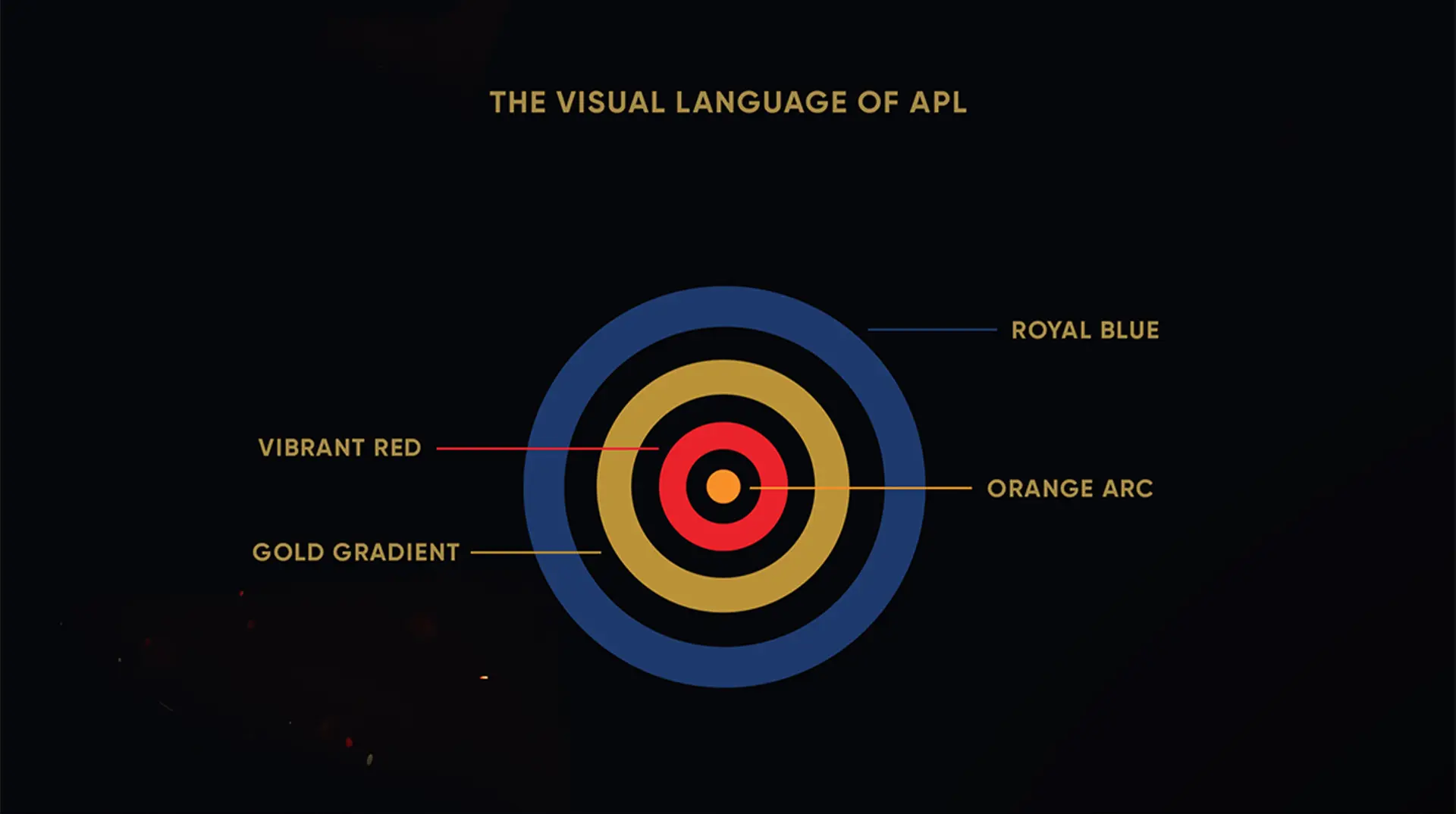
The Core Identity had to achieve four pillars simultaneously. These pillars the brand’s identity translated seamlessly across live match environments, fan-facing collaterals, team merchandise, and league-wide promotional materials.
- Strength & Agility: Communicating the power and speed of the archer.
- Emotion-Driven: Capturing the raw passion, aggression, and resilience of the athletes.
- Sport-Centric: Clearly symbolizing competition, teamwork, and victory, ensuring the identity would not be confused with a corporate or NGO brand.
- Timeless Appeal: Designing assets not tied to passing trends, guaranteeing their relevance for years.
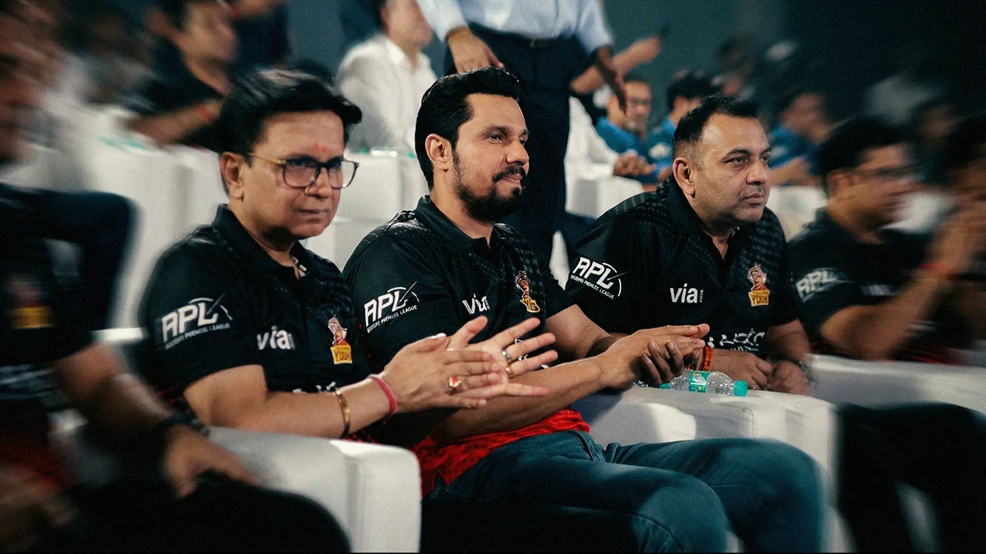
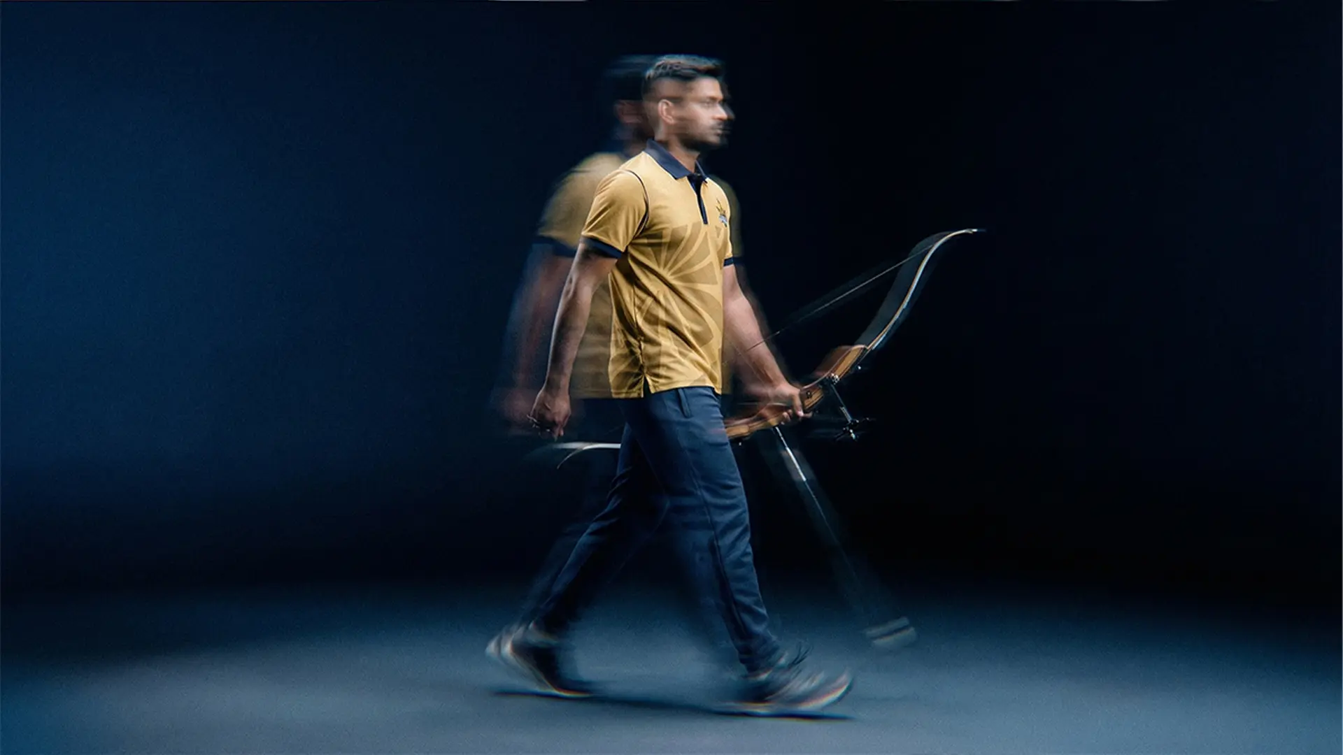
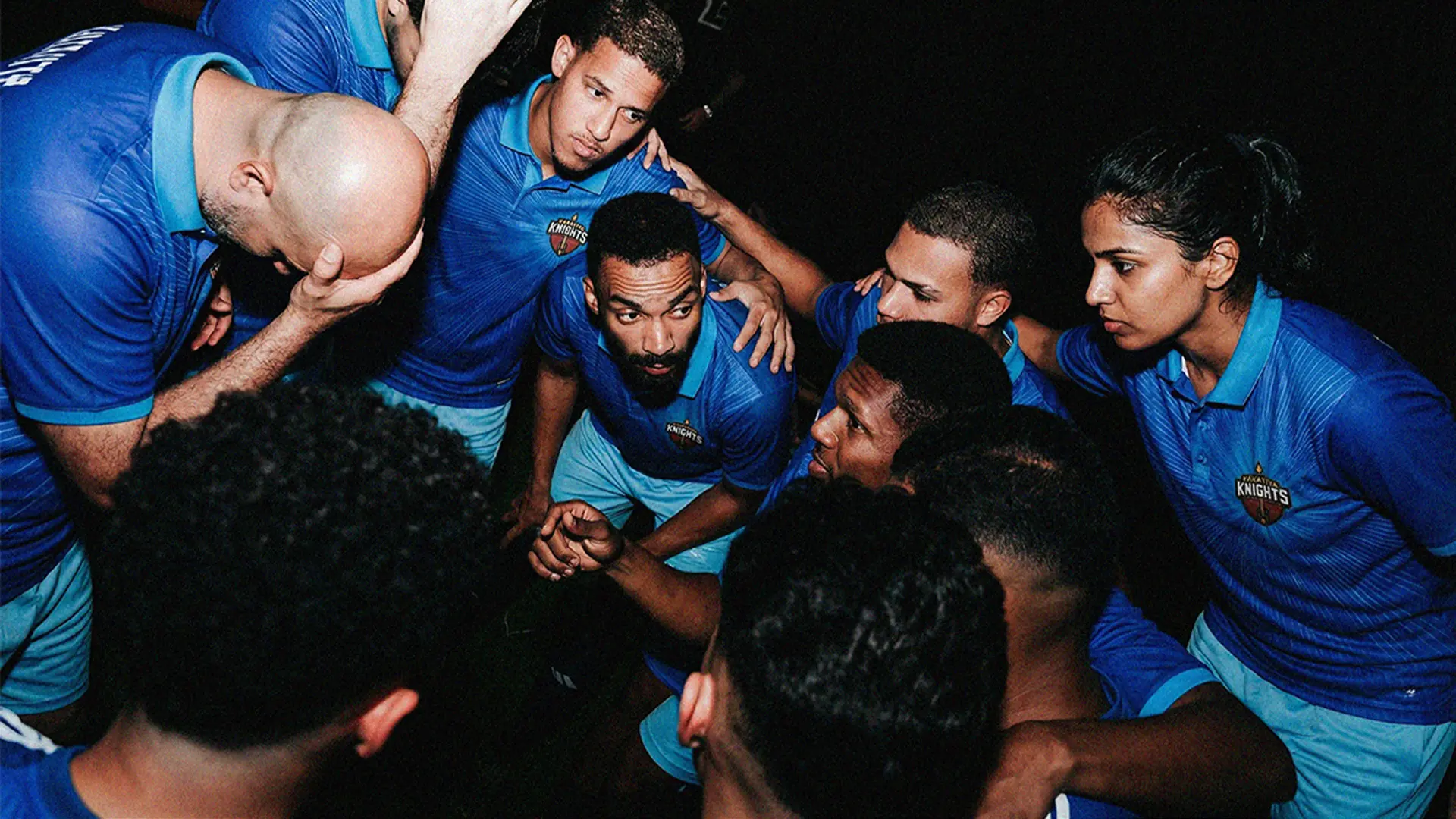
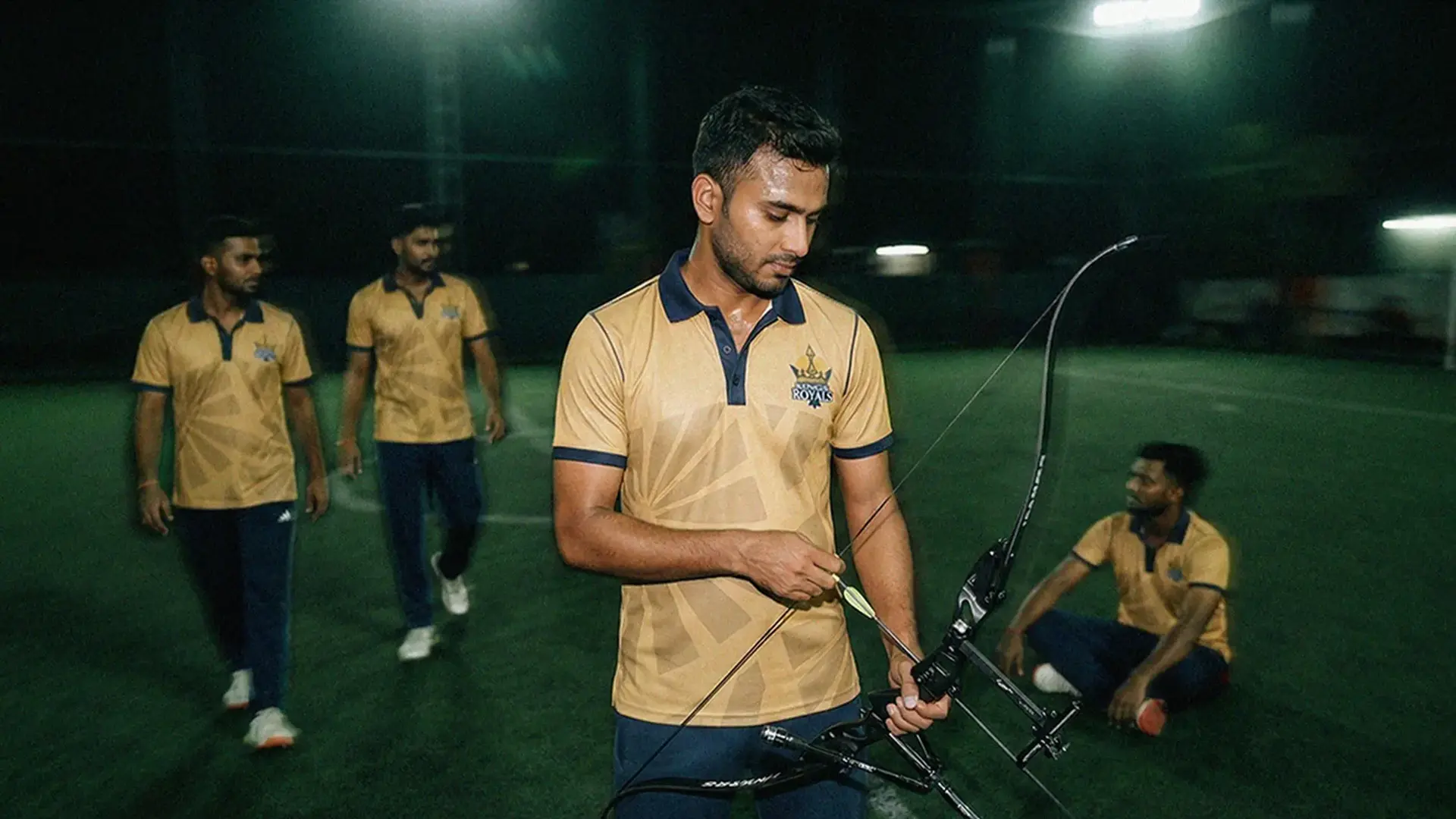
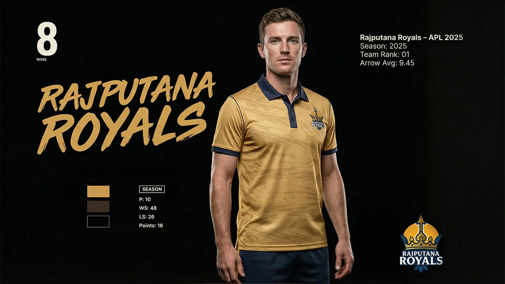
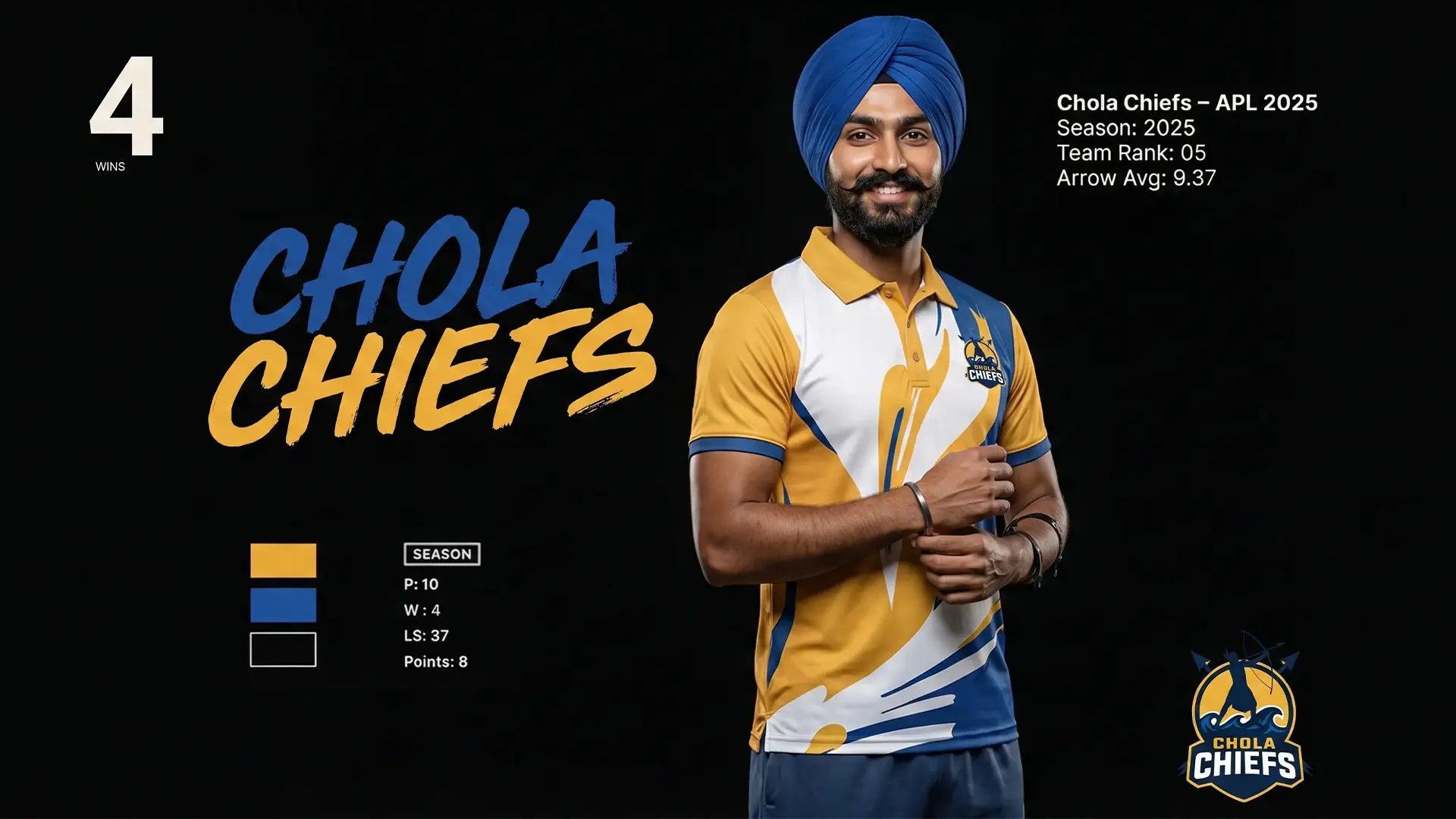
Once the identities were finalized, we dove into jersey, merchandise designs and . Each jersey needed to blend performance appeal with emotional resonance, something fans could proudly wear or wave, carry, and rally behind, whether in stadiums, fan zones, or broadcast visuals. This was not just because it belonged to a team, but because it represented raw passion for the sport.With just days to spare, our team pushed through dozens of design iterations, ensuring every detail, from jersey trims and cap embroidery to flag layouts and sideline branding, aligned with the league’s vision.
Our experience with other global leagues like Euro T20 Slam and GT20 gave us the confidence to handle the creative chaos. We knew how to balance franchise expectations, ownership feedback, and brand consistency under high-pressure timelines.
The result? We delivered a cohesive, visually striking brand ecosystem spanning league identity, team-branding jerseys, caps, flags, and similar merchandise, positioning the Archery Premier League as a bold, modern sporting experience. This proved that even in record-breaking timelines, creativity and collaboration can hit the bullseye.
Every brand touchpoint was designed to perform in high-visibility sports environments, from the field of play to fan engagement zones and televised broadcasts. For us, it wasn’t just branding for a new sports league, it was about setting a branding benchmark for how emerging sports can claim their identity on the global stage. Our sports design agency is getting bigger by the minute and sharper with every shot at creativity.