 Featured As : Top Most Creative Agency in India.....
 +91 99205 57647
“We’re looking for a branding agency for FMCG Brand that would add freshness to our image and the existing market. The logo you designed did the opposite.” And that’s how it ended between the previous design agency and Qmint, a sugar-free breath mint brand. Qmint was new to the crowded market of mint candies. Out-of-their-league brands such as Centre Fresh and DoubleMint were already established. So, they had to find a way to bring a cooler look to the industry. Identifying the right logo design and visual branding was what they needed to mint attention toward themselves.
It was challenging to find the right agency. However, when all hope was lost, Qmint started scrolling online for a branding agency for sugar-free breath mints. It was their last resort to find an expert at a branding agency for FMCG brands. That’s when they found us and reached out. We were ecstatic! We popped a breath mint and went ahead to seal the deal. Our first step was to understand where Qmint’s previous design agency went wrong. Their logo design did not have an aesthetic appeal, styling and proportions were wrong. This is where we had to do some creative thinking. Regardless, we were ready for it.
A breath of fresh air for Qmint: 3 logo design options
Ever since we met, we’ve been committed to our relationship with our client. We know that they are pretty new to an already cluttered market of mint gums. So, our branding and design team researched in-depth about what people associated freshness with, and we learnt a few new things as well.
The visual characteristics of mint showcased:
- Mint leaves that signified natural freshness and flavour
- Ice associated with a cool and refreshing sensation
- Swirls / Thunder / Whirls representing the refreshing sensation of mint
- Tornado / Twister symbolising the powerful burst of freshness
- Frosty mist that appears when you breathe out cold air
- Energy bursts representing bursts or sparks of energy emanating from mint leaves
- Spirals of energy conveying the idea of vitality and freshness
- Gradient green shades to present visual interest through freshness and richness alike
- Abstract mint plant conveying the essence of mint through abstract representations
Therefore, we decided to create three brand logo designs that would not only be aesthetically appealing but also stand out among the big players on store shelves.
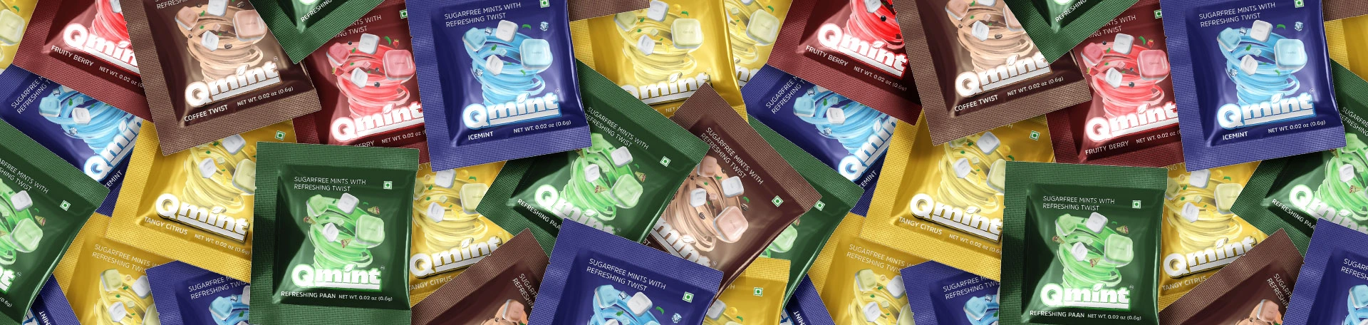
Logo design option #1
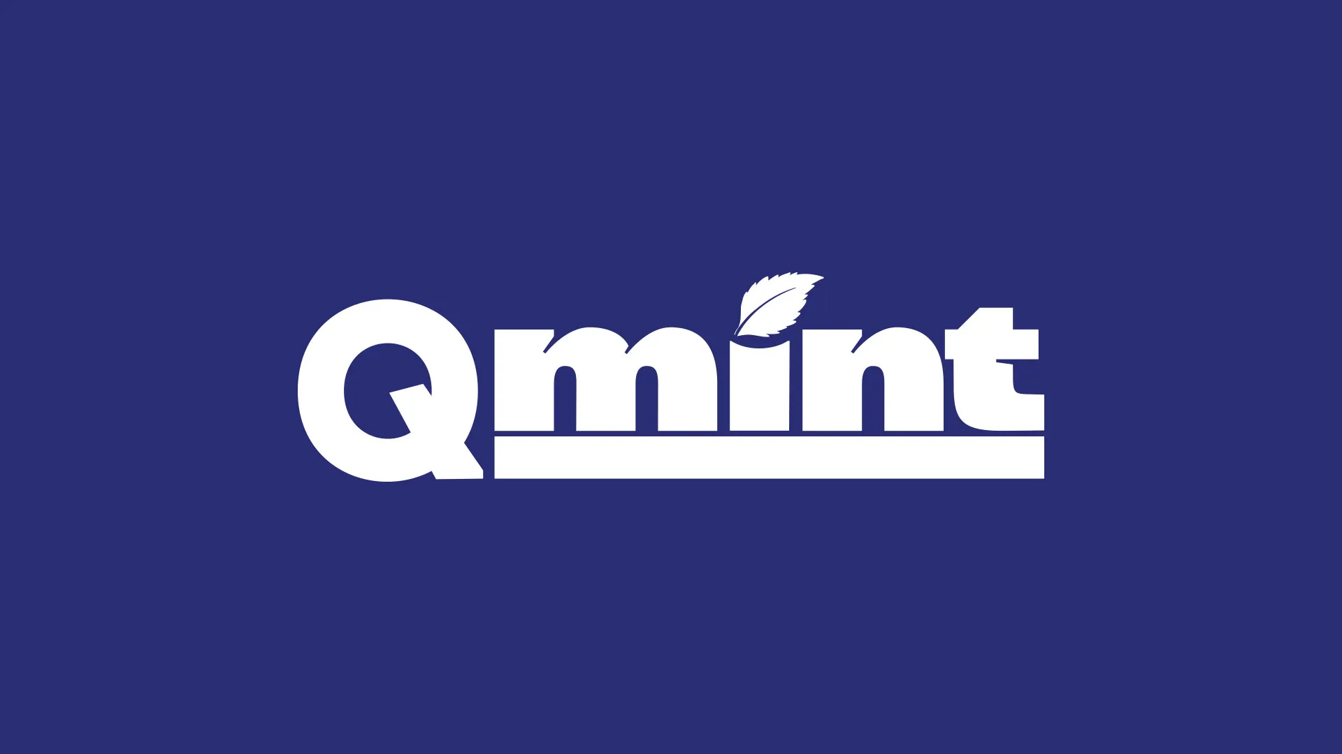
We infused the brand name with the vibe and design of mint leaves giving it the green tinge. The mint leaf that replaced the dot on the ‘i’ in the word ‘mint’ was to emphasize a refreshing and natural feel. With this design, consumers would easily associate the product with a breath mint candy.
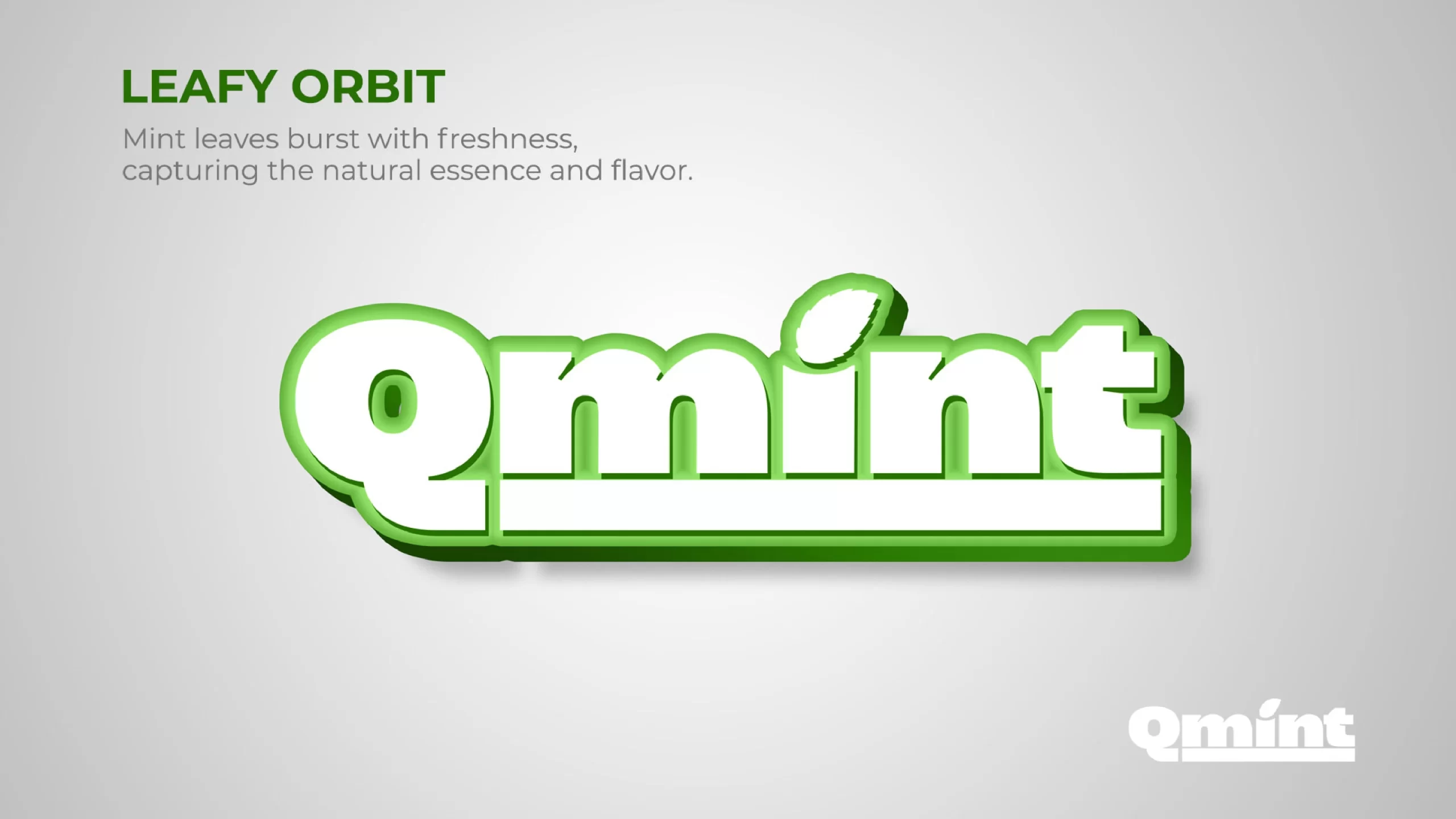
Logo design option #2
Our second design involved creating a logo that conveyed the fresh vibes of mint candies through sparkles. We aimed to symbolise excitement in every bite.
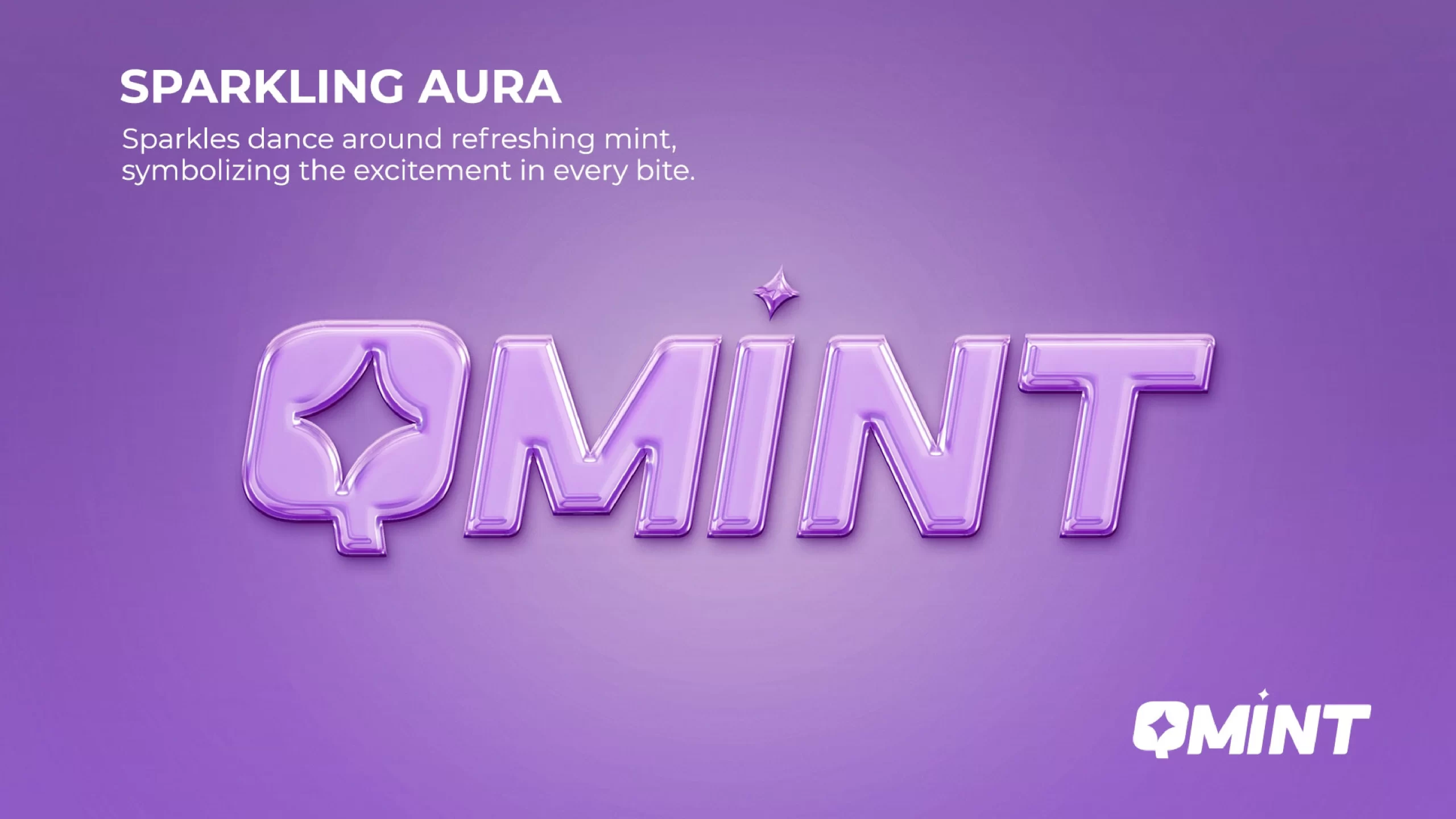
Logo design option #3
Our third logo design represented the thunder that we mentioned earlier. We designed it to depict the minty freshness that explodes in flavour after popping Qmint in the mouth.
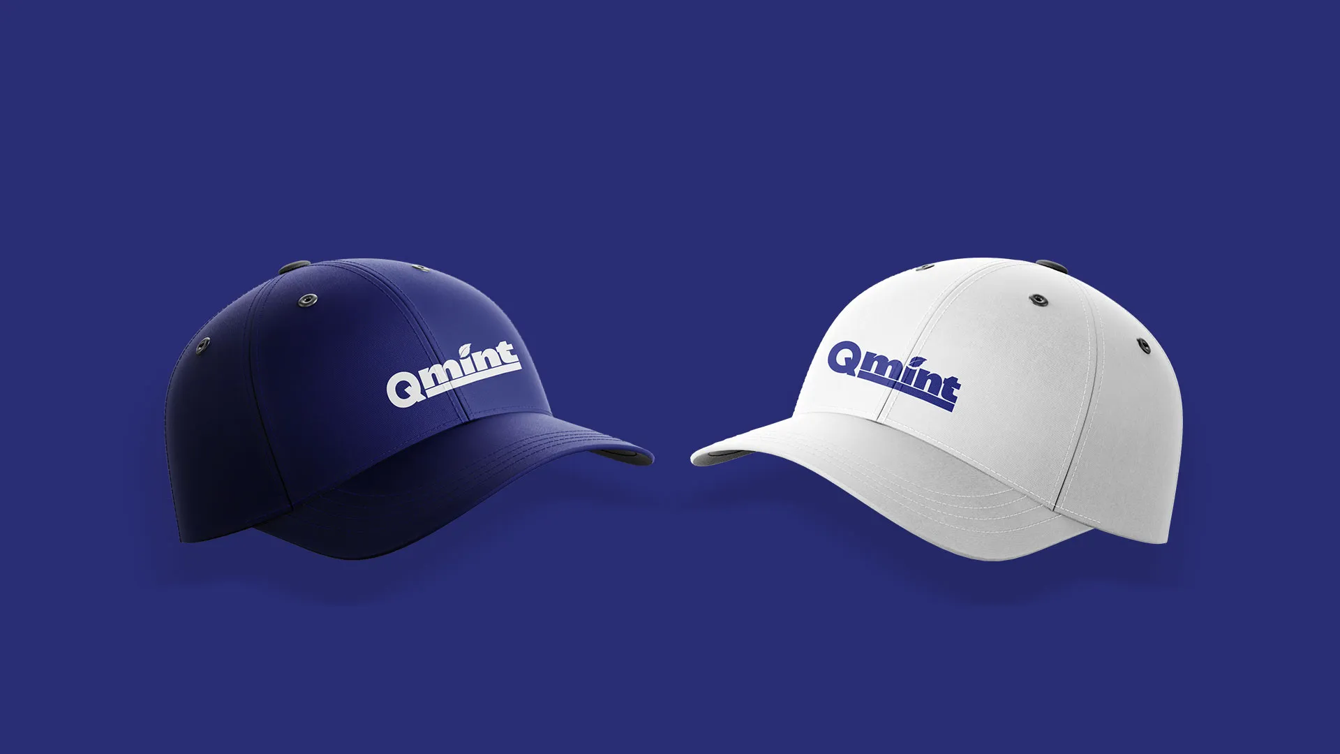
And here began our twin flame journey with the client. They recognized our branding agency as a serious and committed partner in their journey to success. We meant every word we said when we dedicated ourselves to their brand’s image. The client loved the leafy orbit logo design.
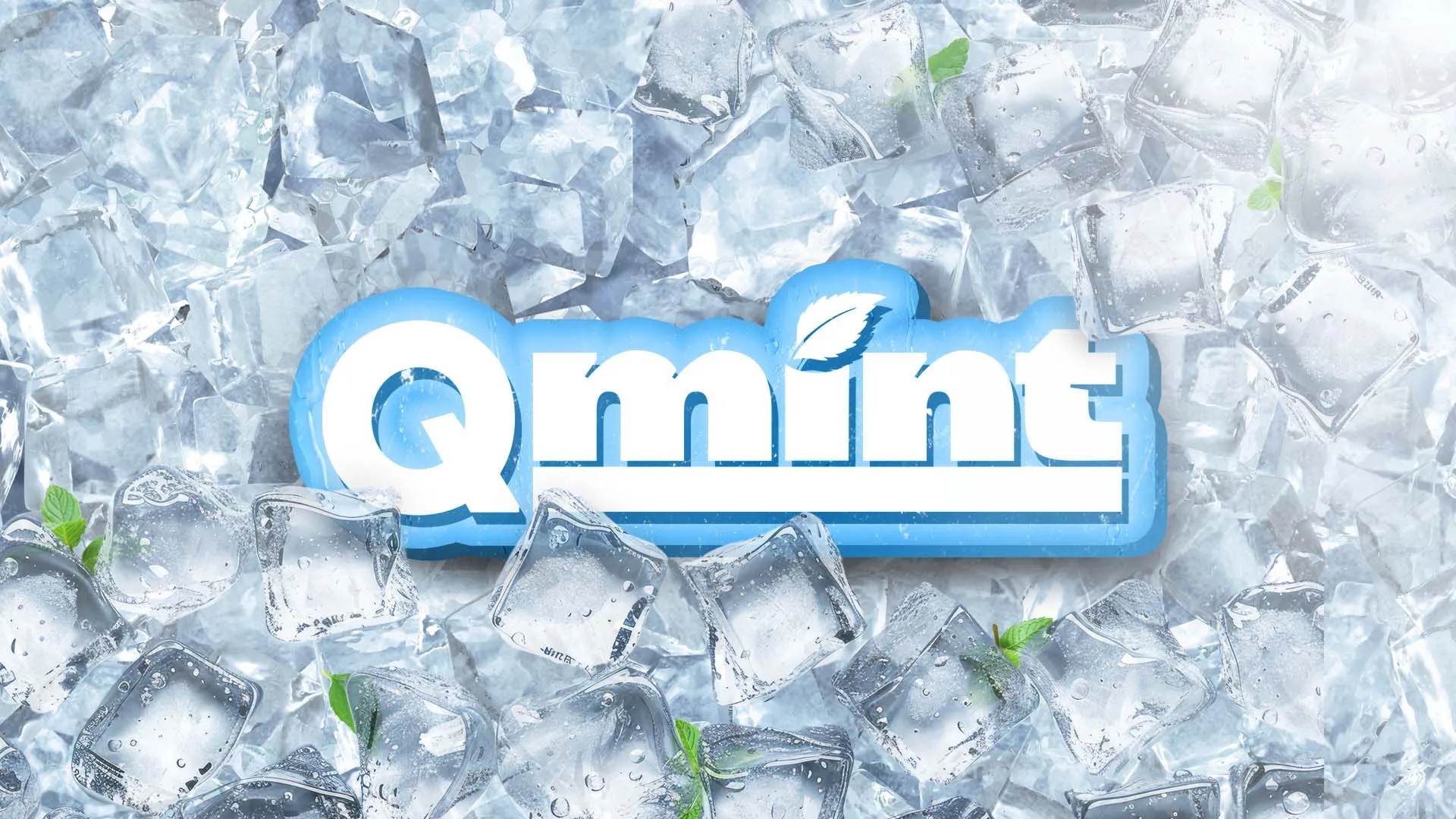
When the logo design was sorted and confirmed, we moved on to creating the brand’s master design for packaging.
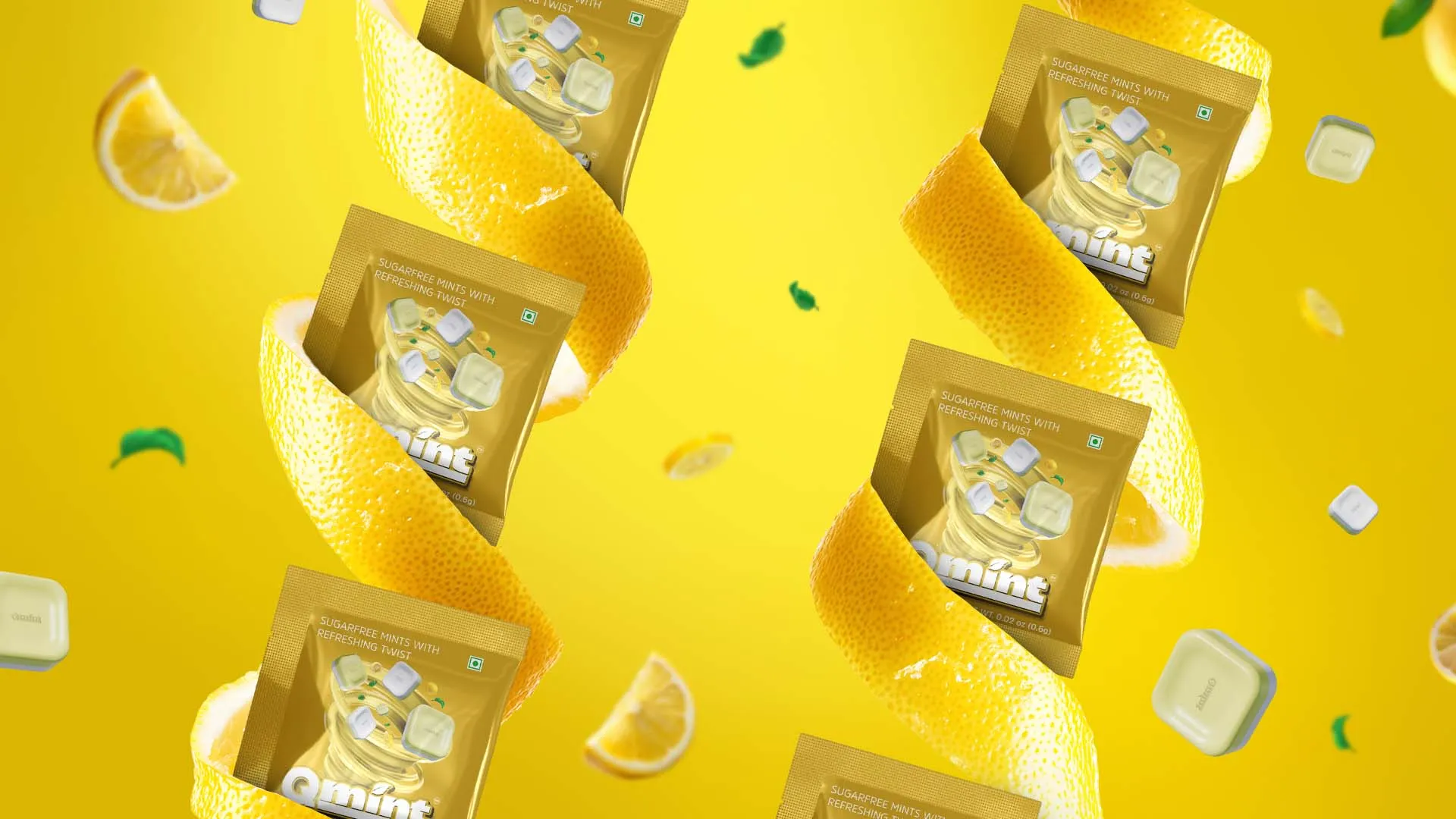
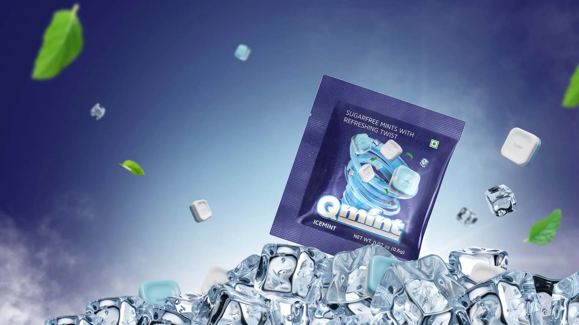
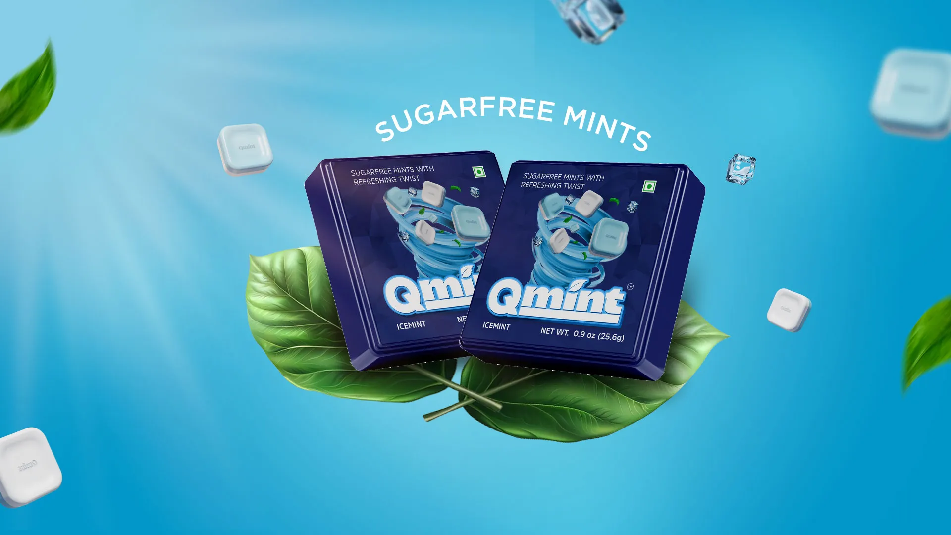
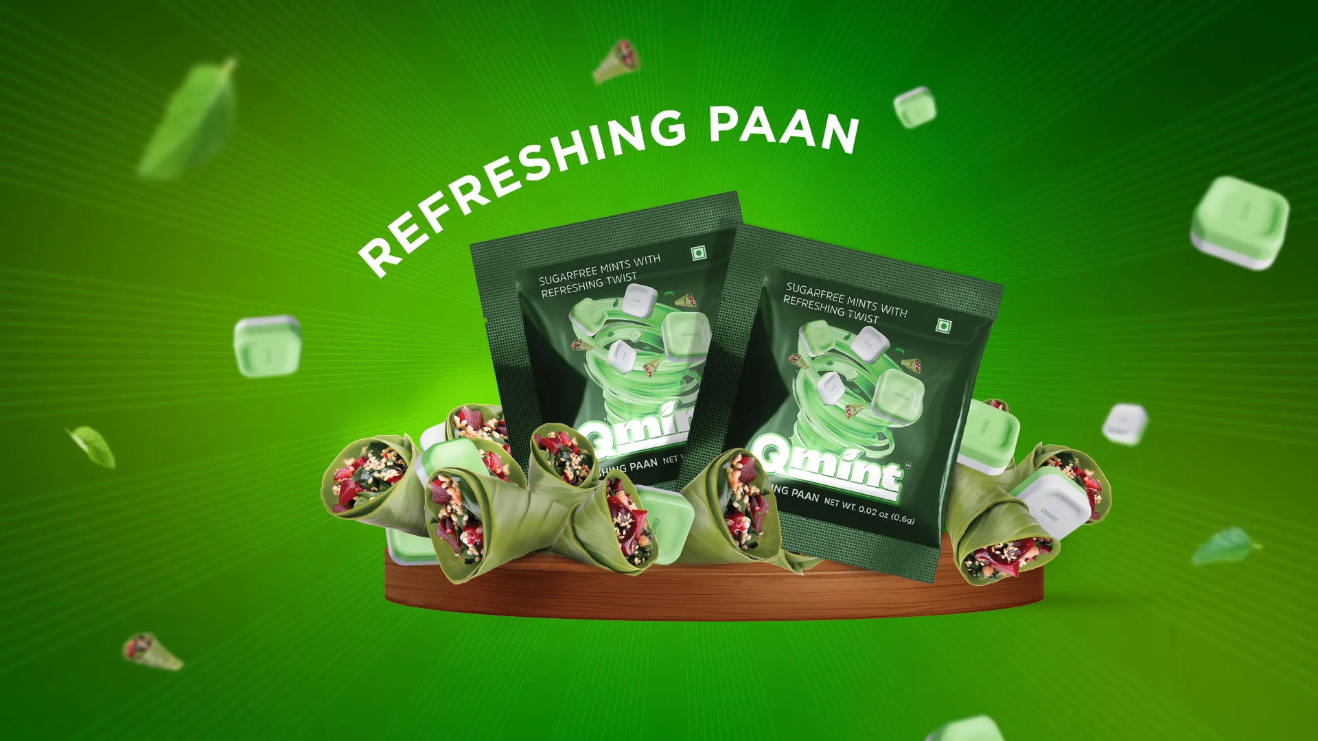
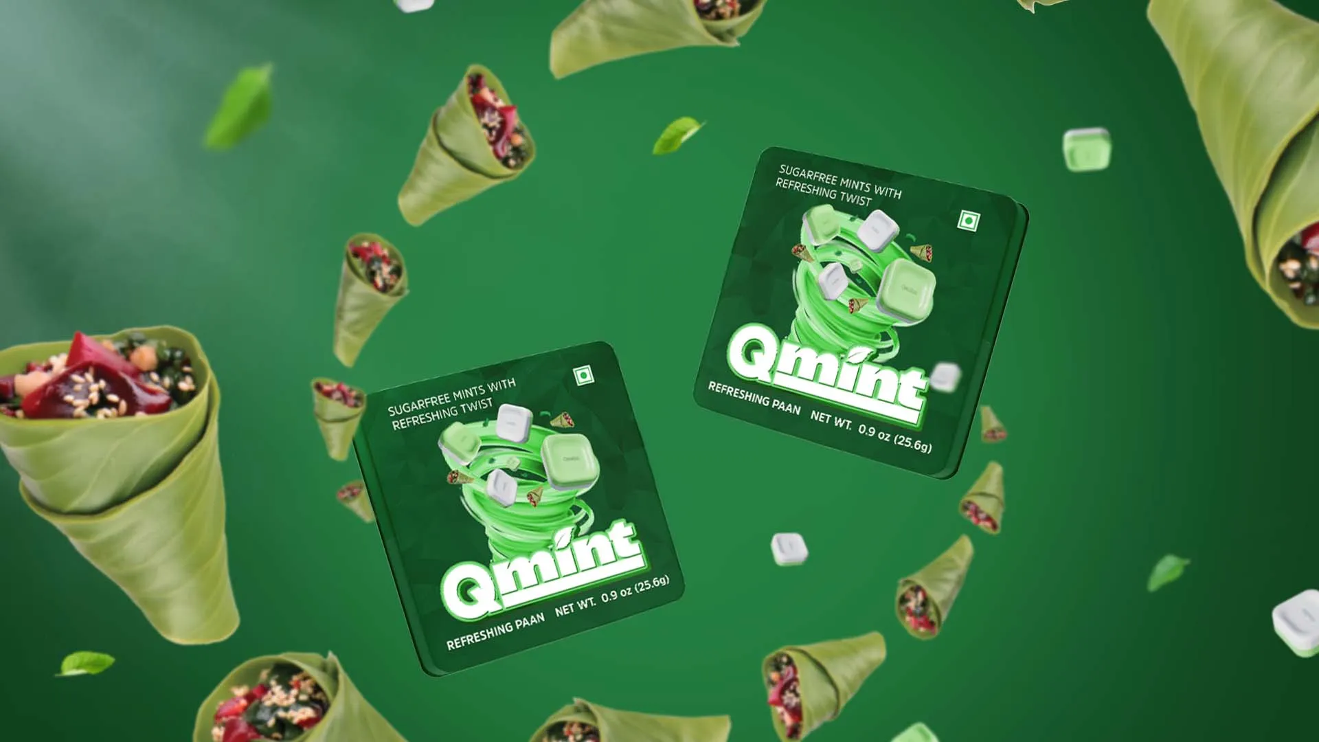
Brand image in Mint Packaging
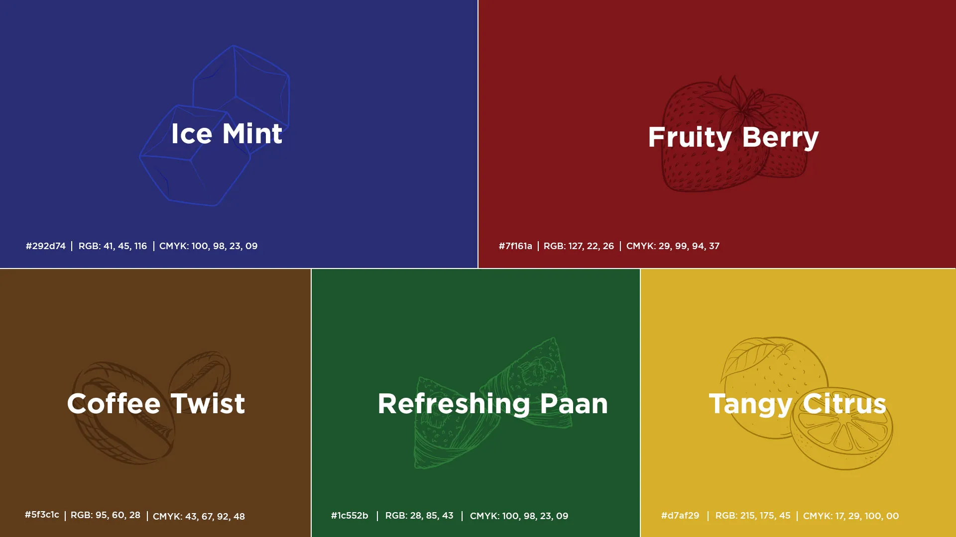
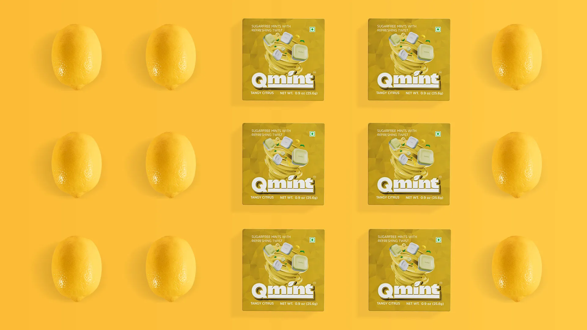
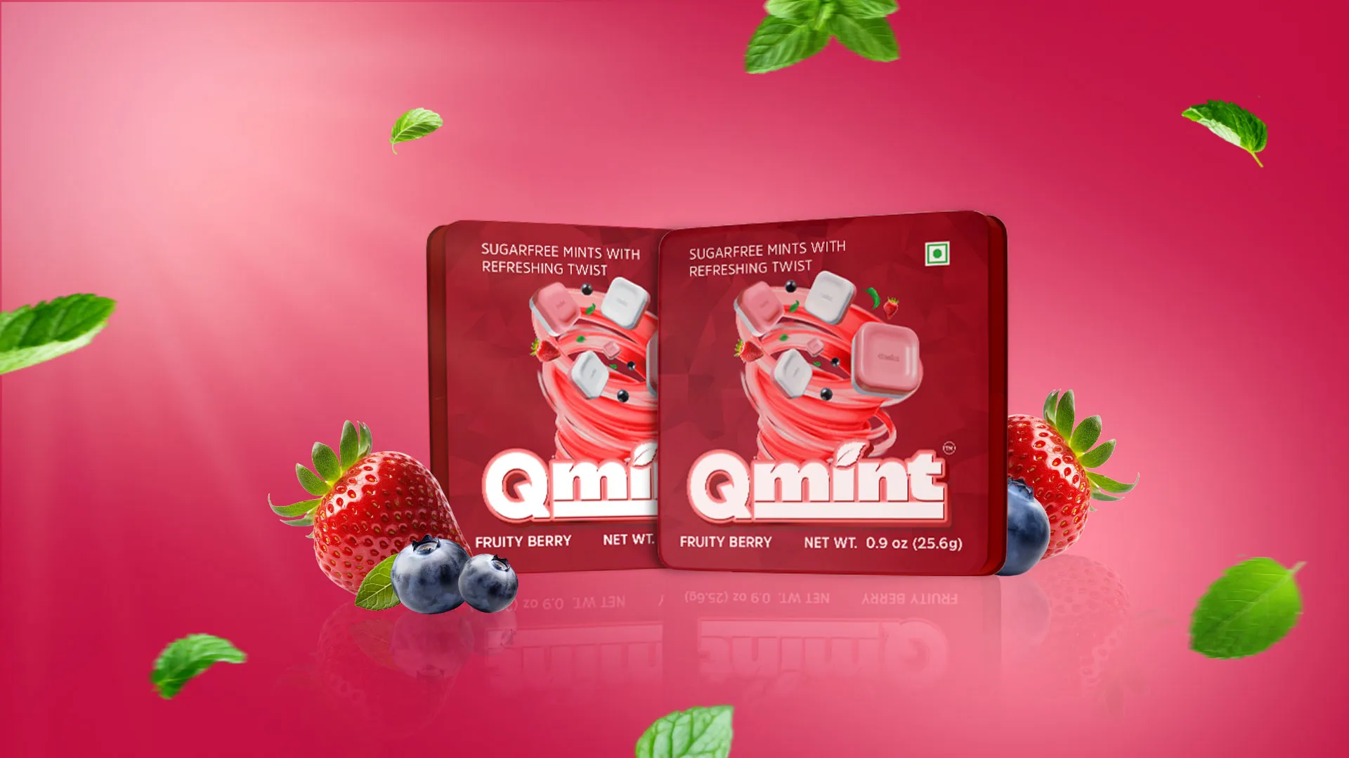
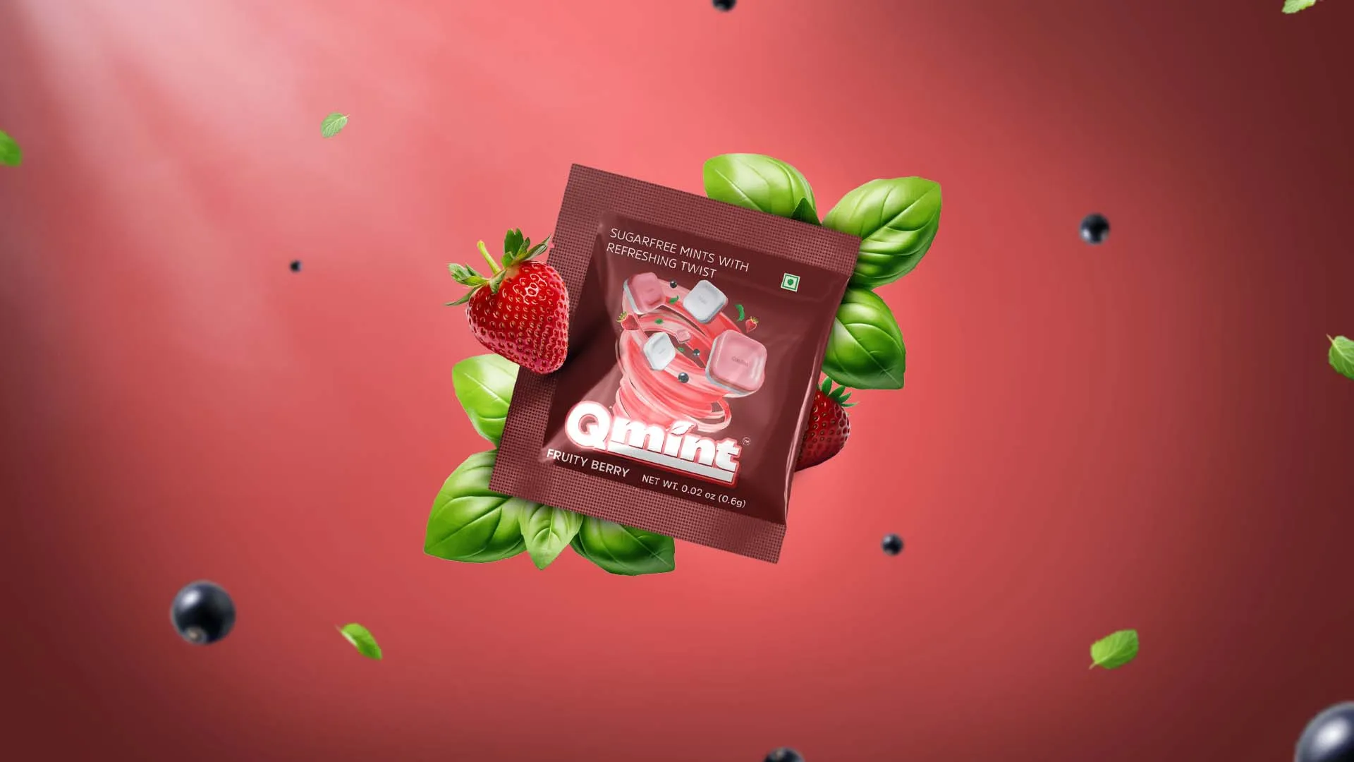
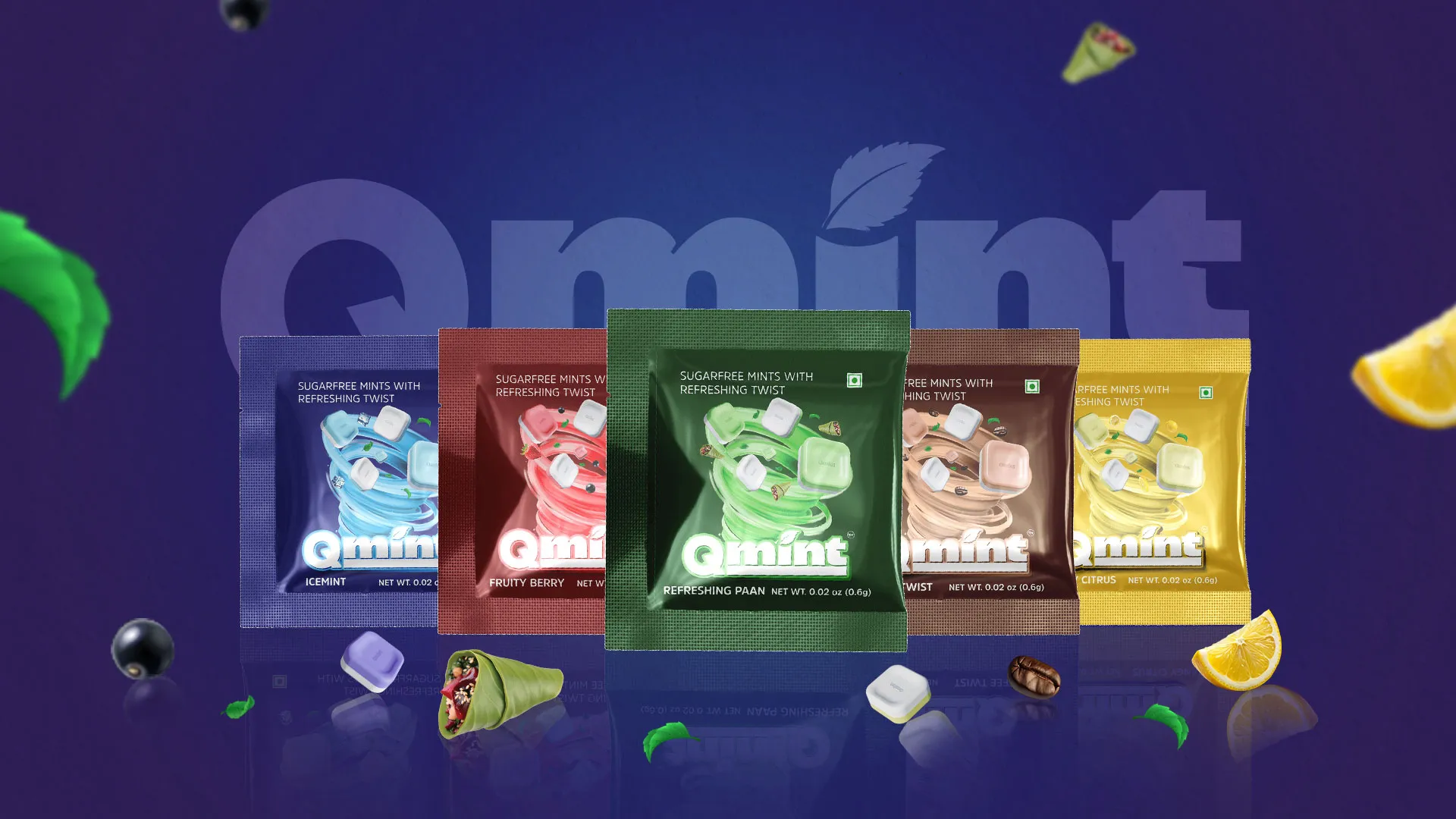
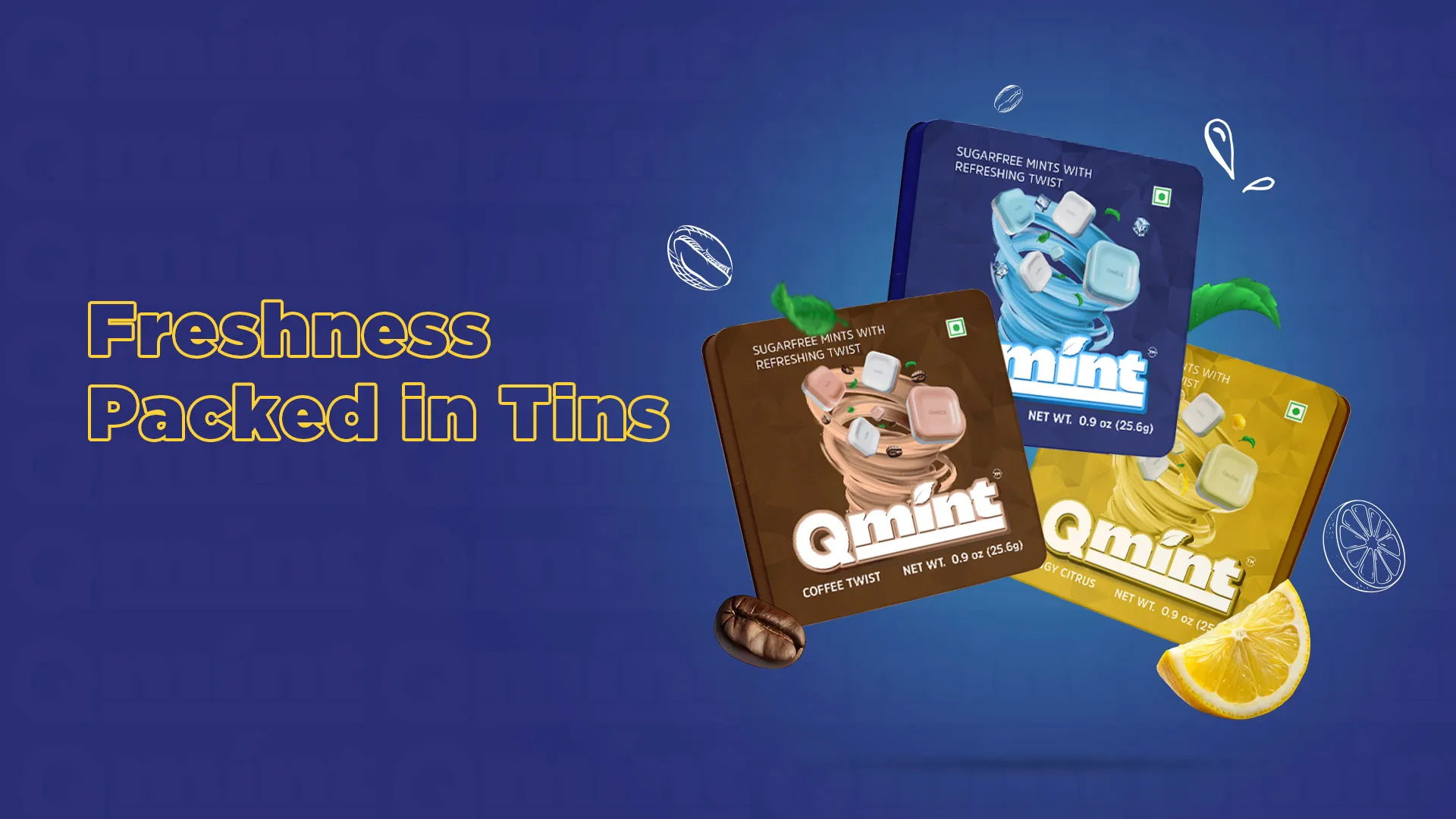
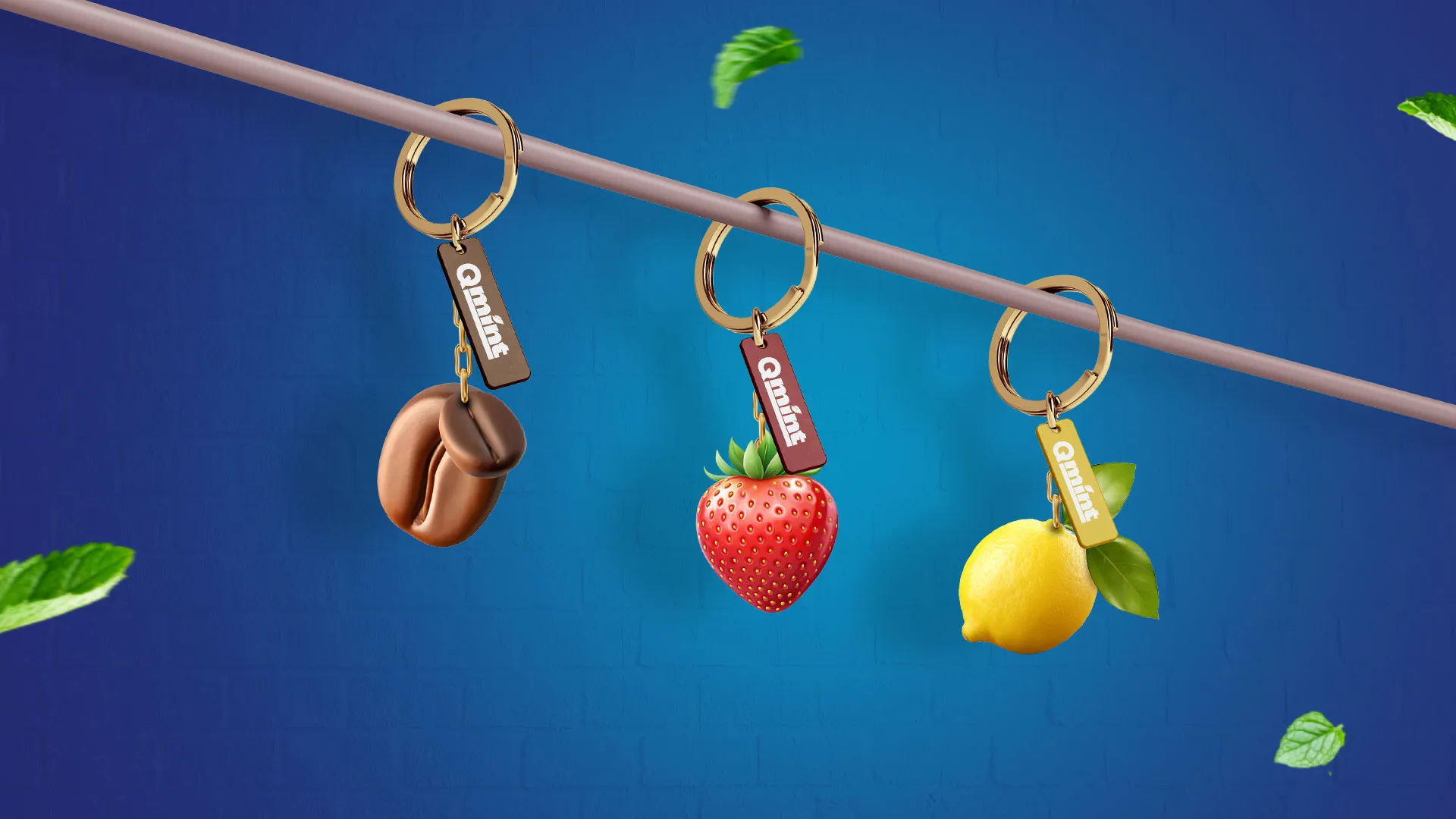
We had won our client’s heart which meant we were going to the next level of our relationship with them: brand packaging designs. We had to create master design options for their products packaged in tins, sachets, and jars. Additionally, the client had rolled out five flavours uncommon to the existing market of mint candies including:
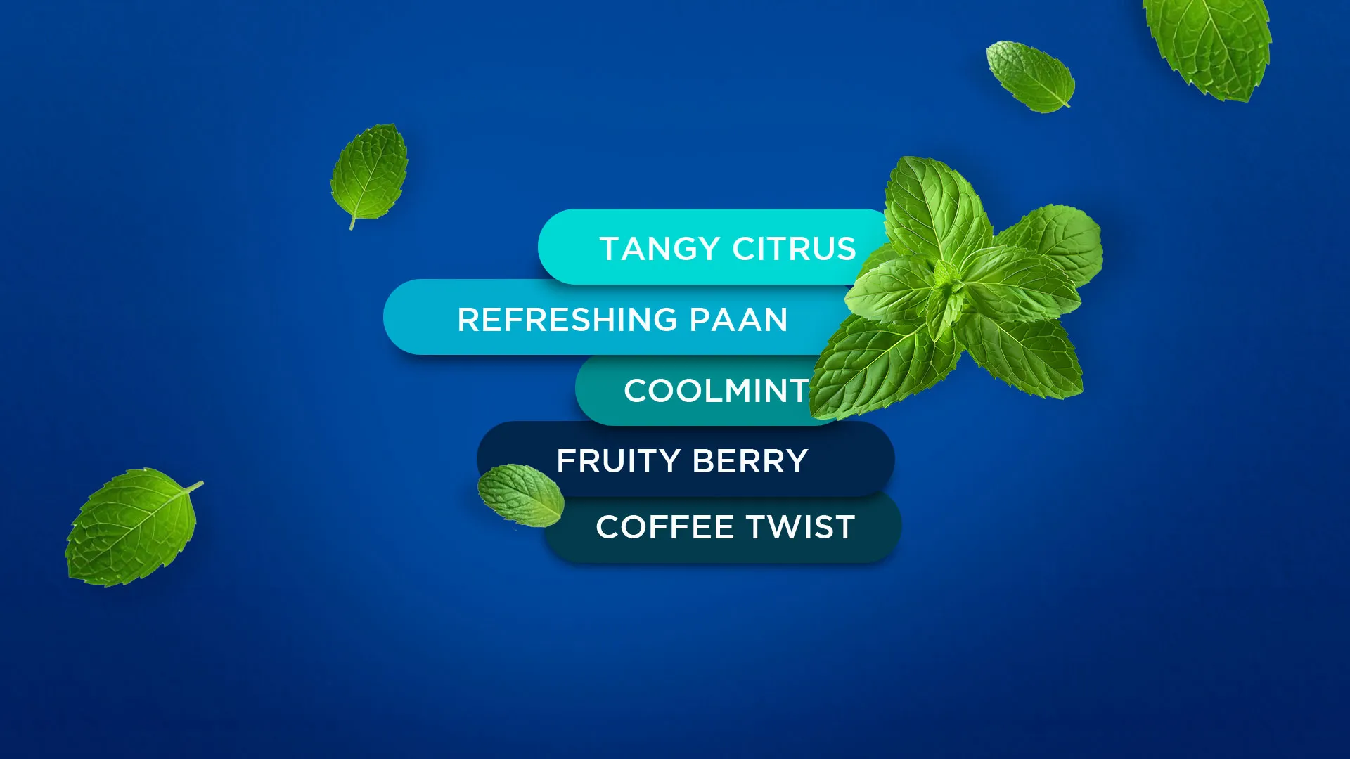
Tangy Citrus
Fruit Berry
Ice mint
Refreshing Paan
Coffee
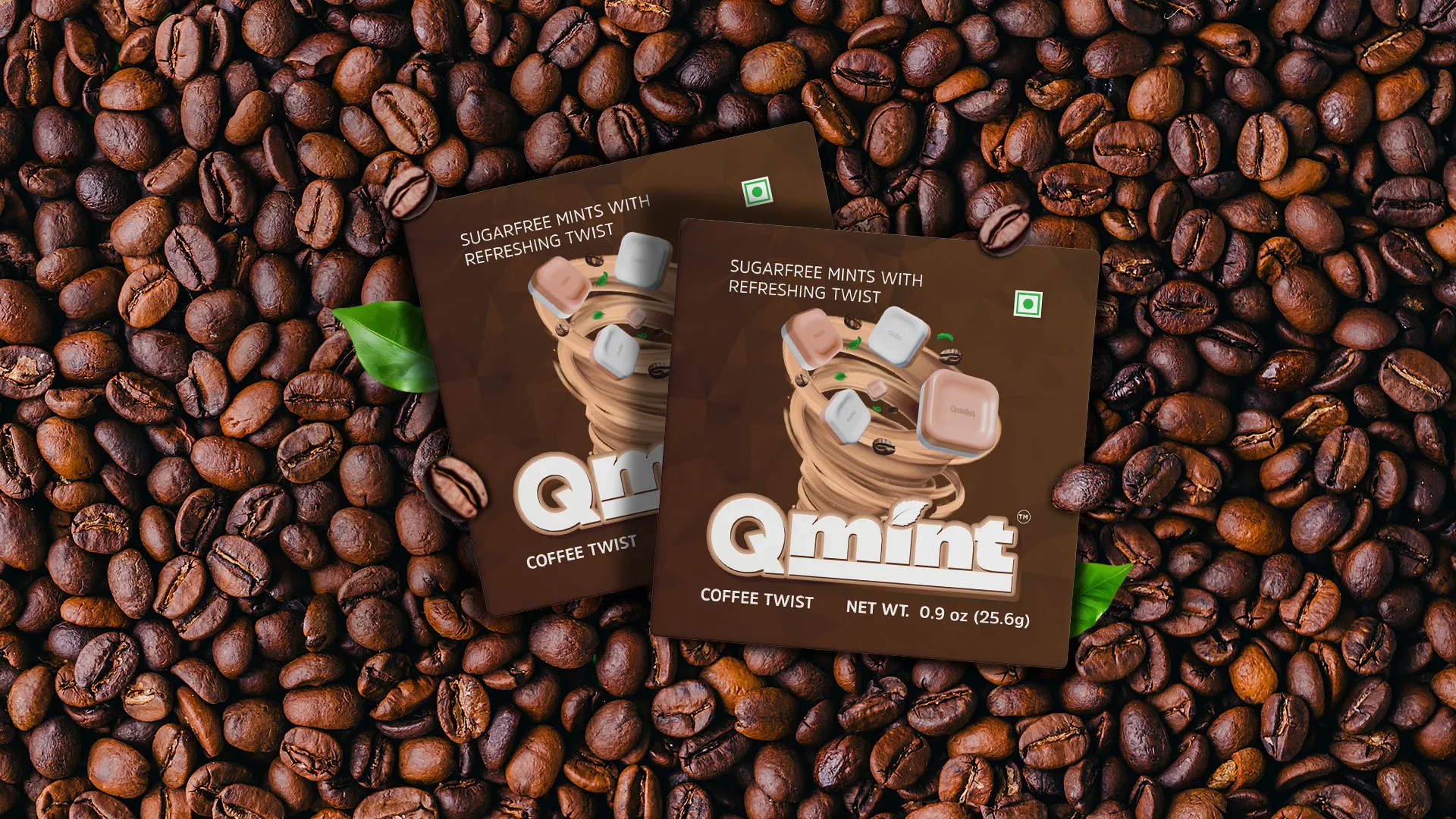
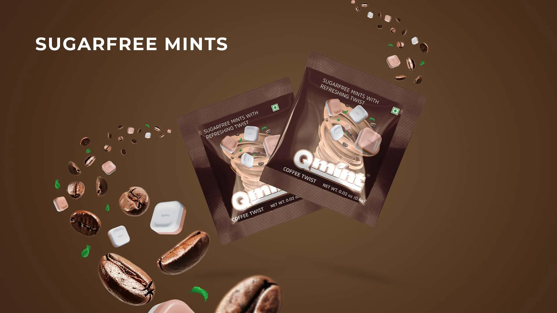
We presented several master designs to the client, each showcasing mint as the hero image. These included a patterned design, a watercolor rendition, and a dynamic swirl emphasizing the refreshing burst of flavor. They loved the tornado swirl design. It was eye-catching and was a definite win-win for enhanced shelf visibility. This design proved different from the big players in the market.
For instance, Centre Fresh emphasized a splash design with mint leaves while DoubleMint showed two mint leaves, and so on. We wanted to make sure Qmint does not blend in with its competitors but rather stands out.
In this way, we were able to level up to the top mint candy brands in the market that were already established.
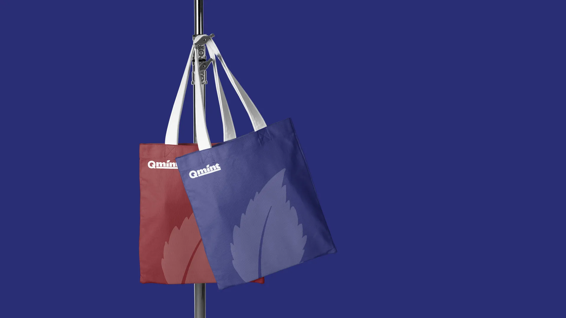
Adding more freshness to the brand
While the market had circular or rectangular-shaped forms, we presented Qmint with a square-shaped form that stood out with a more freshly appealing outlook.
We must also add that we used dummy rectangle-shaped mint candy images during our pitch. Meanwhile, we collaborated with our client to create 3-D rendering of their square mint candies. Doing this helped make them stand out in the market.
Are we happy to be working with Qmint as a branding agency for FMCG Brand? You bet your mint bottom dollar we are! In fact, we’re on another interesting journey with them where we add originality fresh out of our branding kits. This time, we’re focusing on their social media marketing activities to achieve creative branding for mint gums. We’re designing mascots and launching quirky characters that will again outshine competitors. Hey big players, Qmint is here to stay!